Your website gets judged by a lot of criteria—this is inevitable. Website visitors will consider whether or not they like the brand colors, the appearance, the copy. Potential customers will weigh how authoritative your business, your product, or your team appears to be. But one big criteria that is way too often overlooked by businesses? A website’s accessibility. In fact, there’s an average of 51 accessibility errors on the homepages of the top one million websites.

Website accessibility is essential for any business to reach its entire target audience. That’s why today, we’re going through everything you need to do to get started. Here, we’ll cover:
- What website accessibility is and why it’s essential
- Eight website accessibility best practices you need to know
- Three website accessibility tools to help you get compliant
Let’s get to it.
What is website accessibility?
Website accessibility is the practice of building and maintaining your site in a way that people of all abilities can access and understand the information. That means making sure that the information on your website can be accessed and understood by anyone blocking videos, using a screen reader, or looking at your website.
According to the latest Website Accessibility Content Guidelines, website content is accessible if it’s perceivable, operable, understandable, and robust.
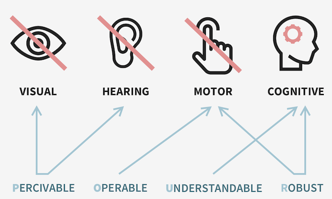
Here’s what this means:
- Perceivable: Information must be conveyed to users in a way that they can perceive (it can’t be invisible to all of their senses).
- Operable: The UI and navigation of a website must work in the ways that users operate.
- Understandable: The UI and operation of the website need to be understandable for the user.
- Robust: All website content needs to be robust enough to be accurately interpreted by users, whether or not they’re using assistive technologies.
Website accessibility includes your site, as well as any tools, dashboards, databases, or other technologies that live on your site. These should all be developed with the same goal of conveying information to people of all abilities. For this post, we’ll focus on your web pages, including your homepage, your about us page, your blog posts, your landing pages, and more. It’s important you get these right—and let’s get into why.
Why is website accessibility essential?
Website accessibility is essential for all businesses so that everyone using the internet can access and understand the information on your website. Because if your website isn’t accessible, you risk missing potential customers, alienating your audience, or even facing legal action. Websites for government offices or for private companies with 15 or more employees must be ADA compliant. And there is a precedent of lawsuits for inaccessible online content.
While compliance is one big reason to keep accessibility top of mind when you’re creating a website or embarking on a redesign, it’s far from the only one. According to the World Health Organization, more than one billion people worldwide live with some kind of disability.
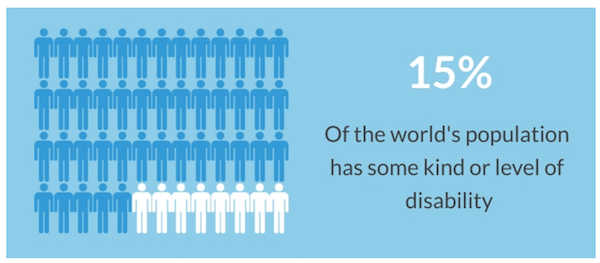
You might think that if your website is simple, this won’t impact you. But even the most basic websites aren’t accessible for completely preventable reasons. In fact, 5.3% of all home page elements have a detected accessibility error. That’s page elements—not just pages. It’s clear that website accessibility needs to be a priority.
You want to make sure your content is as inclusive as possible, and that takes time, effort, and attention. This isn’t daunting, but it is important, so you’ll need a plan. And now let’s talk through the website accessibility best practices you need to know to get started.
Website accessibility standards you need to know
Maintaining an accessible website requires attention to all the elements of your website design, including media content, site architecture, font, and more. This can be overwhelming, but it’s essential, so start with the most important best practices. Here are the key website accessibility standards that everyone working on their website—business owners and marketers alike—need to know.
1. Choose the right CMS
This is the first website accessibility best practice because it’s the most fundamental. You need a content management system (CMS) that supports all of your users and helps you create processes for website development and maintenance that are both effective and easy to manage. This is especially true if you’re a small business strapped for time without a web team.
WordPress has great features for website accessibility, and it’s easy to use once you get the hang of it. Drupal is another ideal option, but this might require web dev help. Website builders like Wix and Squarespace may be limited in support for keeping your website accessible—be sure to double-check before committing, or work with a web design agency to make a website that follows all the up-to-date guidelines.
2. Use alt text everywhere
Alt text is essential for website accessibility. The text, which you’ll typically be prompted to add to all images within your CMS, is contained in an HTML element, and this is what screen readers will use to translate your image for someone who isn’t able to see the graphic on your website.
Take this example from Kristen McCormick’s post about words for emotional copywriting:
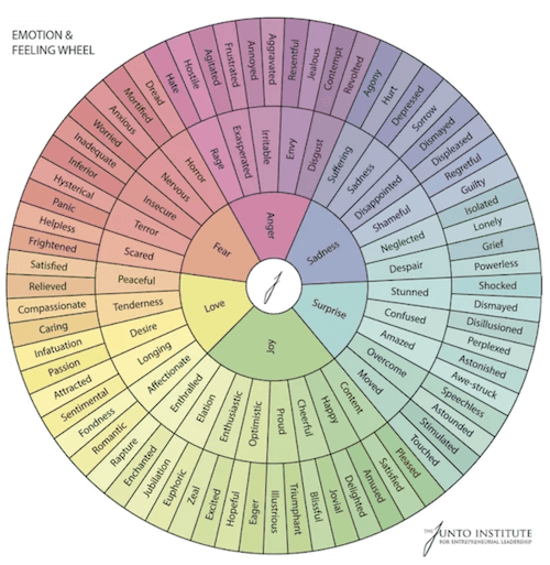
The image is a wheel that expands on feelings and emotion to help give you more options for your marketing copywriting. That’s exactly what the alt text says, so that anyone reading the post with a screen reader knows what’s visible on the screen.
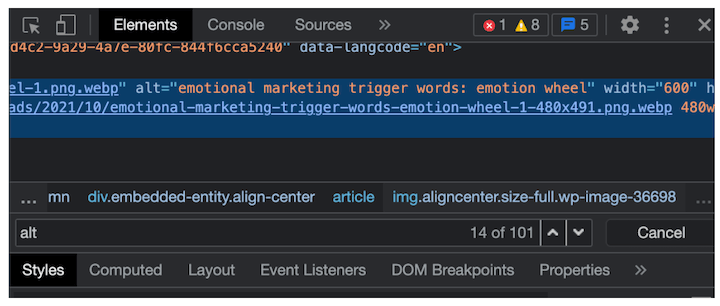
It should be noted that alt text is also an essential part of our on-page SEO checklist, since this is how Google “sees” the images on your page.
3. Avoid conveying information with color or imagery alone
In order to keep your website content accessible to users with different abilities, including users with assistive technologies, you need to avoid any places on your website where you’re conveying information through color or imagery alone. This isn’t going to be understandable for all of your users.
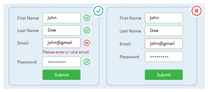
Take lead capture forms, for example. You can’t alert a user of an incorrect entry with only a red box. People with colorblindness won’t be able to detect a difference, and they won’t get the information. Add a text explanation in addition to this color-based cue.
4. Arrange your headings in order
Headings are important for arranging information in your blog posts, since they communicate the importance of the section to the overall post as well as shifts to new sections. These signals help convey the logical structure of the post, which is why you might address headings in your brand’s style guide.
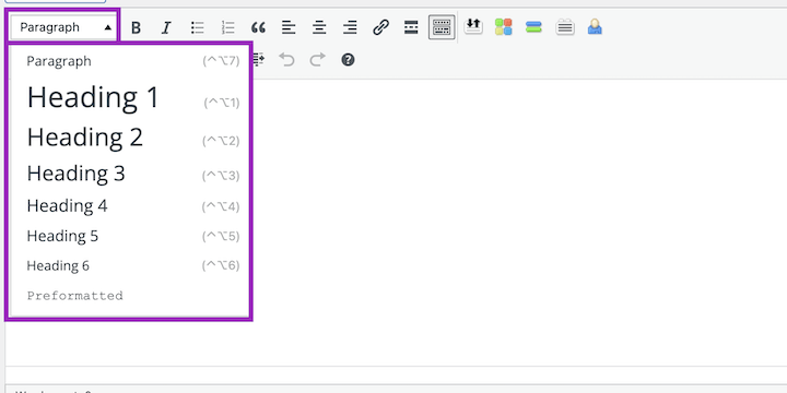
But headings aren’t just a text size or shape, they’re an HTML element. That means they can communicate the structure of the post and the importance of the sections to anyone using a screen reader, as well. This makes keeping them in order even more important. So remember to always go in order, never skipping to an H4 after an H2, and using headings of the same type to note comparable sections of your content.
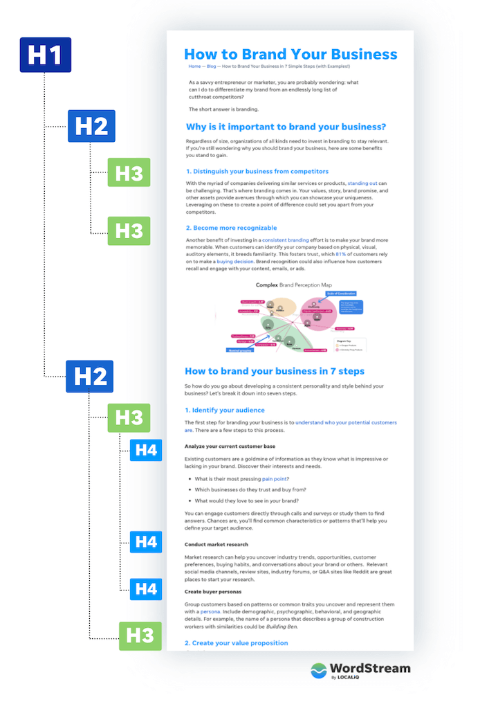
You can also learn more about headings in our on-page SEO checklist.
5. Use easy-to-read fonts
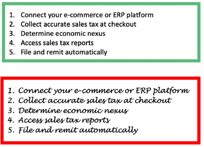
Another related tip: Choose a font that’s easy to read. From an accessibility standpoint, this point speaks for itself. But there’s also a marketing psychology aspect to it. According to the cognitive fluency effect, the harder it is to read something, the less trustworthy it is perceived to be. Furthermore, if that text is describing instructions, the harder that task is perceived to be.
6. Keep all navigation keyboard-friendly
Your website navigation should be accessible to anyone—you want your visitors to be able to engage with your content, to check out your product pages, to sign up for your newsletters, and more. In order to keep your website inclusive, you need to make sure that a user can navigate using a keyboard.
Keyboard users commonly use the Tab key to move throughout a website. Moving throughout your site successfully with this key requires testing and some code setup. Website Accessibility in Mind has a great guide to get started checking your site. Plus, we’ll share some more tools to check your general accessibility in the next section.
RELATED: 16 Ways to Make Your Social Media Accessible & Inclusive
7. Ensure colors contrast
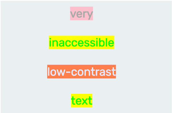
Remember that your website design should be accessible, too. One all too common problem is with color contrast. 86.4% of home pages have low contrast text, which falls below the WCAG 2 AA thresholds—making this the most common website accessibility failure.
The colors on your website, especially the colors of the text and its background, need to contrast sufficiently so that anyone can easily read, whether they have a visual impairment or not.
8. Make information easy to understand in multiple formats
This is the foundation of website accessibility: You need to create content on your website with the knowledge that not everyone will be viewing and scrolling to access and understand the information. If you keep this top of mind, you’ll remember to add alt text and keyboard navigation, and you’ll know that you need to convey information in text, graphics, code, and more instead of relying on a single source, like a video or gif.
RELATED: Get this website accessibility checklist from LocaliQ to make sure your site is up to code.
Website accessibility tools
The website accessibility standards here are a great foundation—but that doesn’t really help unless you apply it to your site. Here are a few simple, easy-to-use website graders that can identify the elements or items that need fixing in order to make your site inclusive for all of your potential customers.
1. Sort Site
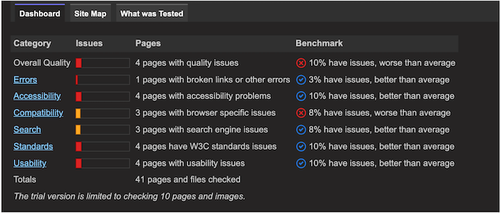
Sort Site is a quick, free tool that scans your entire website to let you know of any errors, and it provides some context. For each error category, you get a benchmark so you know how your website stacks up against averages.
2. Accessibility Checker
Accessibility Checker is sleek and clean, and the results are clearly conveyed in the report. It provides a score, a list of issues, and what needs to happen to correct it.

An example report from a website that needs some work.
3. Website Accessibility Checker Chrome Extension
I love a Chrome extension. CSS Peeper helps me assess or check on-brand colors and font whenever I need, and I find it saves me so much time otherwise spent guessing or referring to a brand guide. This Website Accessibility Checker offers a way to quickly scan whatever page you’re on and get results right away—an excellent tool for anyone committed to keeping their website up to date.
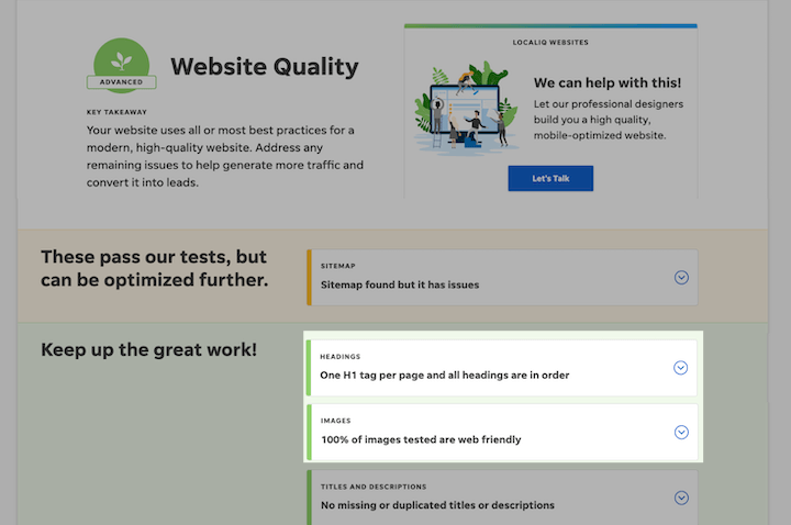
On another note, since many accessibility optimizations overlap with SEO optimization, you can use our free Website Grader to check for missing alt text, heading tags, and other elements.
4. AccessScan
AccessScan is a free tool from Accessibe that anyone can use to check whether their site is accessible. It audits your site, highlights where you fall short, and, most importantly, points out how to remediate these shortcomings.

Prioritize website accessibility for your business
You want to make sure that your business and your marketing reach your audience—and in order to do just that, you need to prioritize website accessibility. Use these free tools to get started identifying the areas you need to improve, and then go through the website accessibility best practices above to make sure you’re compliant and inclusive.
To recap, here is your website accessibility checklist:
- Choose the right CMS
- Use alt text everywhere
- Avoid conveying information with color or imagery alone
- Arrange your headings in order
- Use easy-to-read fonts
- Keep all navigation keyboard-friendly
- Ensure colors contrast
- Make information easy to understand in multiple formats
Good luck!


0 Comments