In part two of this series, you learned how to transform the data we will be using to create our dashboard. In this article, I will show you:
- How to build the scorecard.
- How to use conditional formatting.
- How to use the camera tool.
Presentation (the “P” in “DTP”)
Again, we are using the DTP framework created by the smart folks at Juice Analytics. The presentation layer for our exercise consists of all the pieces of our dashboard:
- Dynamic charts and scorecards
- Dynamic controls for date ranges and campaign filtering
Building dynamic dashboards in Excel can be a challenge, but if you’ve already completed the steps from the first two posts in this series you’ve done the hard part. Now we are ready for the fun stuff.
The Dashboard Tab
First, we need to create a new worksheet and rename it “dashboard.” This is where we will put our charts, scorecard, and the dynamic controls for our dashboard. Please highlight all cells and resize the column widths to 18px to match the default row heights. This will give us a uniform canvas to work on.
Building the Scorecard
Creating our scorecard, like the one in the AdWords dashboard, is very easy, because we took the time to prepare our data properly.
For example, to get our sum of current impressions, you simply use this formula: =sum(curr_impr). Of course, “curr_impr” is the name we assigned our “Sum of Impressions” column in our pivot table, so using the formula above will result in the summed total for the “Sum of Impressions” column. Here’s how you put the scorecard together:
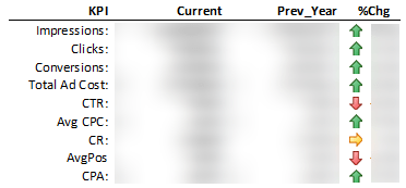
1. Somewhere to the right of your pivot table, located in the “transform” tab of your worksheet, create a small table similar to the one shown below. Include all of the column headers and row labels.
2. Use the following formulas for each “Current” metric:
a. =sum(curr_impr)
b. =sum(curr_clicks)
c. =sum(curr_conv)
d. =sum(curr_cost)
3. Use the following formulas for each “Prev_Year” metric:
a. =sum(prv_impr)
b. =sum(prv_clicks)
c. =sum(prv_conv)
d. =sum(prv_cost)
4. Now we need to create our calculated metrics referencing the cells that contain the formulas above. For example, CTR = sum(curr_clicks)/sum(curr_impr). Calculate the rest of the metrics shown in the image above using this method for both your current and previous year.
5. To calculate your percent change use the following formula = current/previous-1 and copy the formula down the #Chg column.
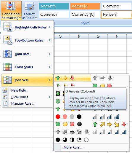
Next, we want to use conditional formatting to add our colored arrows.
1. Highlight all of the values in the %Chg column.
2. Select “3 Arrows (colored)” from the “Conditional Formatting” drop-down located in the “Home” ribbon.
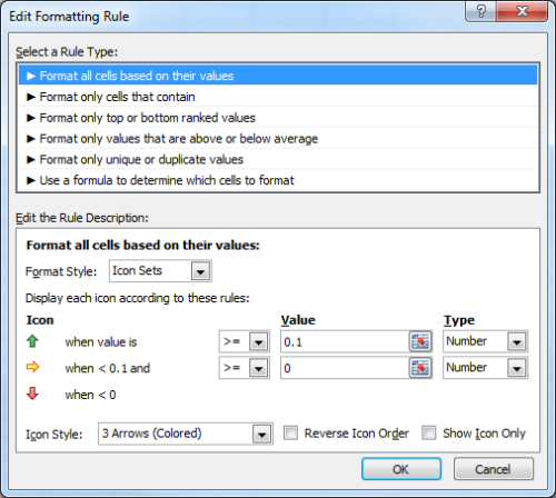
3. Next, highlight all of the values in your “%Chg” column again and select “Manage rules…” from the “Conditional Formatting” drop-down in the “Home” ribbon.
4. Then highlight your rule and click “Edit Rule…”
5. Now you can edit your rules to change arrow types based on whatever thresholds you wish. Here’s the way I set it up:
6. Format the rest of your table to your liking. I made the background white, bolded my header row, and bolded my current values.
Once you have your formatting the way you like it, you should have a finished scorecard, but it’s not where we need it. In order to get our scorecard on our dashboard tab, we are going to use the Excel camera tool.
The camera tool allows you to take a snapshot of any area in your workbook and create a moveable picture. This gives us the flexibility to put our scorecard anywhere we want on our dashboard without it being tied directly to cells. It will also update automatically after we had our dynamic controls.
Here’s how you add the camera tool to your quick access toolbar:
After you’ve added the camera tool to your quick access toolbar, highlight your new scorecard and click on the camera tool, then click anywhere in your dashboard worksheet to paste the image of your scorecard. You can then position it anywhere you want.
In part 4 of this series we will learn how build the charts we need for our dashboard. You will learn some best practices to use when creating multiple charts and we will prepare them to change dynamically when we adjust our date ranges and campaign filters.
by Chad Summerhill, author of the blog PPC Prospector, provider of free PPC tools and PPC tutorials, and in-house AdWords Specialist at Moving Solutions, Inc. (UPack.com and MoveBuilder.com).


0 Comments