In part three of this series, you learned how to build our dashboard’s scorecard. In this article, I will show you:
- How to build the charts.
- How to copy and reuse your charts to save time when building multiple charts.
Building the Charts
The AdWords Campaign Performance report only has two charts and they allow you to choose from many different available metrics for comparison. Our dashboard isn’t really limited by space, so we will be creating a chart for each of our KPI’s.
- Impressions
- Clicks
- Cost
- Conversions
- CTR
- CR
- CPA
- CPC
The best way to do this is to create and format one chart for one KPI, and then we will copy the chart several times for each of the other KPI’s. This technique will save you lots of time, because you will only have to format your chart once.
Follow these steps:
1.Insert a blank Line chart into your dashboard worksheet.
2.Add “impressions” as a series by right-clicking on the chart and clicking “select data.”
3.Add “prv_impressions” as a series using the same method.
4.Add “date” for your X axis using the same method mentioned above.
We will be replacing these series later with named ranges.
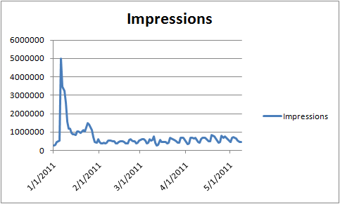
You should have a chart that looks something like this:
What we need to do next is format our chart for our dashboard:
1.Move the legend to the bottom and rename them “Prev” and “Current.”
2.Change all font sizes to 8pt (we need all the space we can get).
3.Remove horizontal gridlines from the “Layout” menu > Gridlines > None.
4.Add Major Vertical Gridlines from the same menu as mentioned previously.
5.Format the gridlines by right-clicking and clicking Format gridlines…Change the line type to a dash and the line color to a gray.
6.Format the X axis dates by right-clicking the X axis and clicking Format axis…Change the alignment to vertical and the format to dd/mm.
7.Remove the border from the chart area by right-clicking on the chart and clicking on Format Chart Area…
8.Change the chart type of the prv_impressions seriesby right-clicking on the series and clicking on Change Series Chart Type…Change it to an area chart.
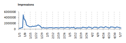
After all of your formatting, you should have a chart that looks something like this:
The next steps involve replacing our current and previous chart series and X axis with our named ranges located on the transform worksheet.
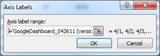
- Right-click on the X axis and click “Select Data…” Then click the “Edit” button on the Horizontal Axis Labels.
- Replace the contents with: =‘GoogleDashboard_042611.xlsb’!date (GoogleDashboard_042611.xlsb is the name of my workbook. Use the name of your workbook here.)
- Right-click and click “Select Data…” again, but this time “Edit” the “Current” series.
- Change the contents to: =GoogleDashboard_042611.xlsm!curr_impr
- Repeat step 4, but this time “Edit” the “Previous” series and use this formula: =GoogleDashboard_042611.xlsm!prv_impr
Now our chart series and X axis will reference our dynamic named ranges instead of the static columns. In the next steps, we will copy our original formatted chart and create our multiple charts for each or our KPI’s.
Make sure you are through making formatting changes to your chart before your proceed. You won’t enjoy making the same formatting change to eight different charts.
1.Select your chart and Copy it.
2.Then select a different cell and Paste it back to your dashboard worksheet.
3.Go ahead and delete the legend from your new chart. We will be stacking the charts and you will only need the legend to be present on the bottom chart.
4.Change the X axis font color to white, so that it will be invisible.
5.Copy & Paste this new chart six more times until you have eight total charts on your dashboard worksheet.
6.Position your charts as seen below (you will have to use the “Bring to Front” tool when creating your overlaps):
7.Now follow the steps described previously for changing your series named ranges. For example you can change the bottom right chart to show conversions by changing “curr_impr” to “curr_conv” and “prv_impr” to “prv_conv”.
8.You can also add chart titles for each KPI chart.
After you’re though changing your charts to reflect all of our different KPI’s you are ready for the next and final step in creating our AdWords dashboard. In the next post I will show you how to pull everything together and make your charts and scorecard dynamically change when you adjust date ranges and campaign filters using Excel controls.
by Chad Summerhill, author of the blog PPC Prospector, provider of free PPC tools and PPC tutorials, and in-house AdWords Specialist at Moving Solutions, Inc. (UPack.com and MoveBuilder.com).


0 Comments