You’re sitting at your desk planning a landing page. Your wireframe probably looks something like this:
Landing page wireframe via Dribble
Everything seems to be in the right place: copy, bullets, testimonials, a video…and last, a placeholder for that all-important image.
Here’s a question for you: How do you choose that image? Do you leave it up to the designer to choose something they like? Do you choose something similar to what your competitors are doing? Or do you simply use an image of your product?
If you’re doing any of the above in your quest to produce a high-converting landing page, it’s time to reconsider your strategy. You should choose your landing page image very carefully, since it needs to catch your prospect’s eye AND appeal to him or her on an emotional level.
In this article, I’m going to map out the exact steps you need to take for choosing a high-converting image every single time you plan a landing page.
First things first, though:
Why are images so important?
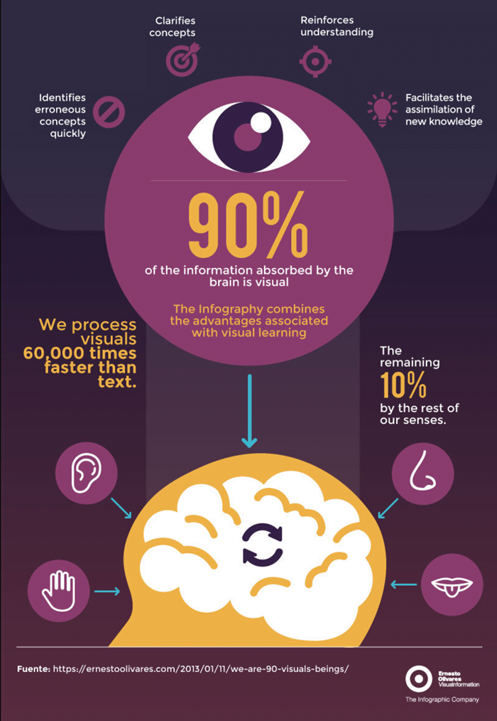
Humans respond to and process visual data better than any other type of data. In fact, the human brain processes images 60,000 times faster than text, which means the first thing your prospects see on a landing page is the image and the colors you use.
90% of information transmitted to our brain is visual, with the remaining 10% divided between the rest of our senses. Our eyes are our primary way of consuming and understanding information.
How the brain processes visual information, via ernestoolivares
In his study “Imagery and verbal processes,” Allan Paivio states that our ability to remember words depends on our ability to visualize their referents. Paivio is most known for his dual-coding theory, one of the most influential theories of cognition in the 20th century, explaining the practical use of imagery as a memory aid.
Why do we remember images better?
Simply put, images evoke different memories and experiences than do written words. As this study shows, we have a remarkable ability to remember more than 2000 images with at least 90% accuracy over a period of 7 days—even when images are only presented for a short duration of time.
In addition, it takes only 150 milliseconds for us to process an image, and another 100 milliseconds to attach any meaning to it. (FIAS)
These stats are what make image-driven social platforms such as Instagram, Pinterest, Tumblr, and Snapchat so successful. The use of images and videos on these platforms capture most of our attentive mind and pull us in time and time again.
Over the years, many studies have been conducted on the subject of visual processing and the importance of imagery in marketing. The studies consistently find that images are the best way to help convey feelings that drive conversions.
Images are more than just placeholders to make a page look nice; they have a significant role in persuading prospects and customers to take the next step. As MIT Professor Mary Potter explains:
“The job of the eyes is not only to get the information into the brain, but to allow the brain to think about it rapidly enough to know what you should look at next.״
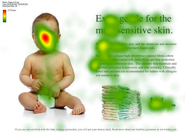
Capitalize on placement by using your hero image to direct the prospect’s attention towards the action you want them to take. The most famous representations of this are the heat maps shown below. As you can see, when the baby is looking at the reader, most of the clicks and attention are paid towards the baby.
Most visual attention is focused on the baby’s face
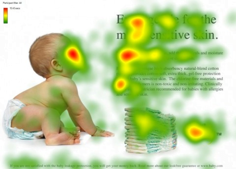
However, when the baby faces the text on the right and looks straight at it, the prospect’s gaze and attention is also directed toward the text:
Visual heatmaps show that an image can guide the viewer’s gaze
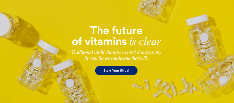
Directing your prospect’s attention at a particular element can be done by more than just having your hero image “look” at the call to action button; you can also place different objects around it like Ritual does. Through the product placement and use of contrasting colors, Ritual has made their call to action button the focal point of their page.
A CTA button with high contrast
TakeCareOf uses the visual of a hand to direct complete attention to their call to action button:
Open palm as visual cue
These are all ways of using images to increase conversions. And while the vast majority of websites use these techniques, they still lack one huge component – emotional appeal.
The missing link
Since the image is one of the first things prospects see on your landing page, it’s imperative that it has a strategy behind it that results in leading customers towards taking action.
Most businesses settle for one of the following images:
- The solution
- Someone using the solution
- A video of how to use the product
- An illustration of the solution
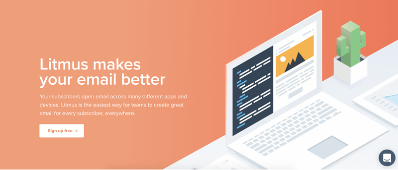
Litmus, for example, has a visual of a computer and email.
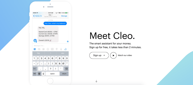
Cleo shows their app.
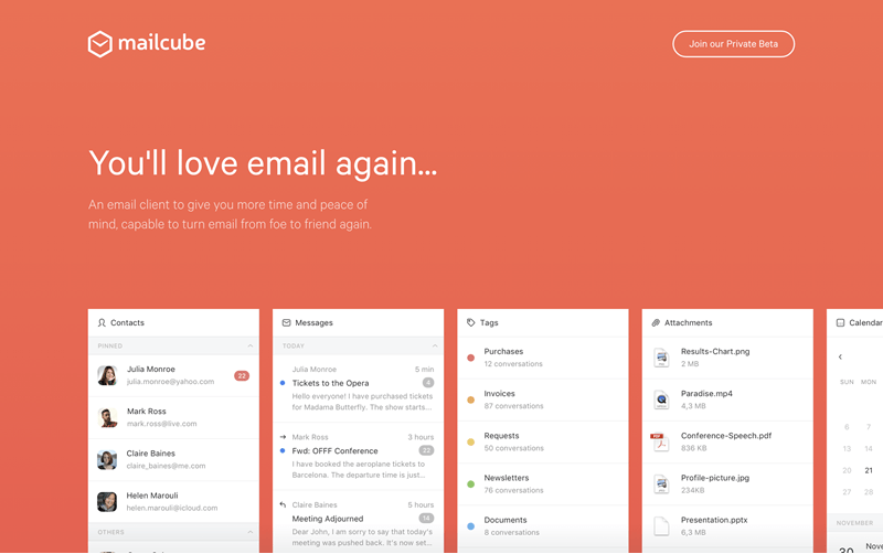
Mailcube uses a visual of their platform.
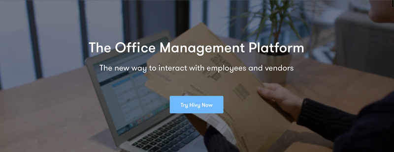
And Hivy simply shows a video of people using their management platform.
There are countless examples of this strategy. Marketers, designers and all those involved in choosing the image for a landing page seem to result in highlighting themselves rather than the customer.
However, as I like to say:
No matter what you’re selling, what people really care about isn’t the what, it’s the why.
In other words, what you should be doing is considering the prospect’s motivations, desires, and needs, and portraying those in your hero image, not yourself. Or, as we defined it: Emotional Targeting.
How Emotion Increases Landing Page Conversions
Though we love to think we’re completely rational beings, our decision-making process is almost entirely emotional. Everything we buy has an emotional reason behind it.
A prospect that arrives on your landing page is trying to solve a challenge. This could be a personal challenge (finding something to wear) or a business one (getting the team to collaborate). Whether your prospect wants to feel loved, be more successful, have higher self-esteem, earn people’s respect or just feel safer, when she lands on your page, she expects you to make those desires come true.
News flash, you can’t do that by making it about you (your solution)—you do that by making it about her.
Since images evoke certain emotions in us, we can use them to make people feel a certain way and drive them towards an action. Below are two image strategies I’ve literally tested a thousand times, and have seen their success time and time again.
Image Strategy #1: The Current Feeling
The current feeling technique is a way of reminding the prospect of the problem they are facing and the importance of dealing with it. This is usually the right strategy for a prospect that is in the “unaware” state of awareness.
Examples:
- A platform that offers better, easier payment solutions could test an image that shows the frustration of selling and accepting payments online.
- A team collaboration platform could use an image that emphasizes the struggles of working as a remote team.
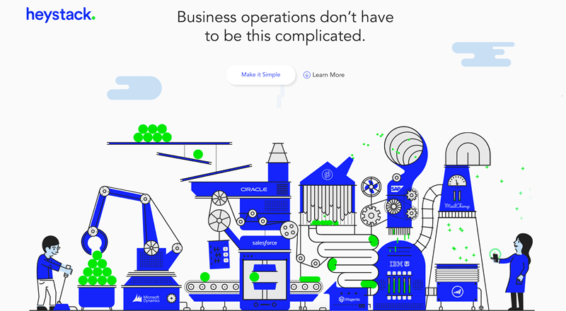
HeyStack does a lovely job at making you feel the pain of running the operations of a business. HeyStack shows prospects they know exactly what they’re going through by using an image that visualizes the pain they’re trying to solve.
A landing page depicting current-state emotions
Only after taking in this image does the visitor scroll down and find more information about their features, the app, and other technical elements of the solution.
Your goal in the “current feeling” strategy is to show prospects you understand their challenges and their pains. Only once prospects understand that, can you address how you solve their challenges.
Once you’ve created the “current feeling” variation, I’d A/B test it with the second strategy:
Image Strategy #2: The Desired Outcome
Instead of showing an image of your solution or product, a good example of using emotional targeting in your images is by showing prospects the outcome of their purchase – the desired result.
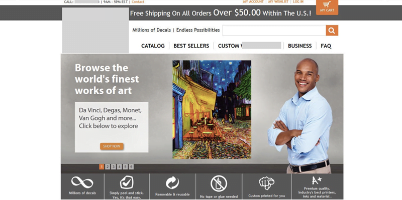
In the example below, we helped an ecommerce site selling decals and custom stickers optimize their homepage. The original variation below featured the specific decals and stickers customers can use to decorate their home, used a stock photo of a random guy on the page, and lacked personalization. In short, it didn’t show prospects what a decal might look like in their home.
The original landing page
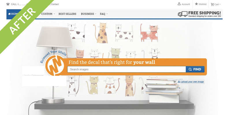
In the variation we created, we used visuals that portrayed the desired result – a beautiful, serene home with great decor and a sense of ease. Our goal was to show the customer she can decorate her home easily, with little effort and see great results. Additional changes included emphasizing the search bar, and removing roadblocks such as the rotating slide images, the bullets and the amount of calls to action.
The more emotional variation we tested
Our changes increased conversions by 550% for our client.
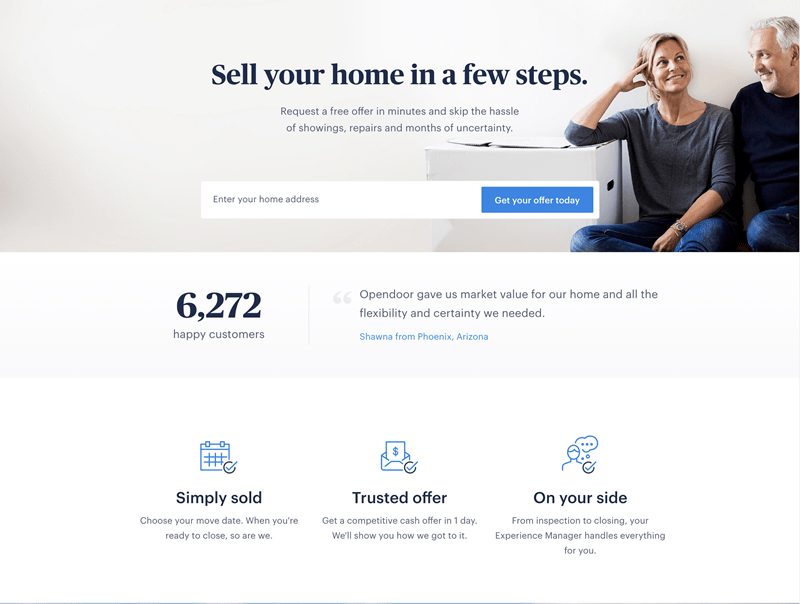
Here’s another great example from Opendoor. Rather than showing a photo of a house with a “SOLD” sign on it like most real estate companies do, Opendoor uses an image of a couple sitting on the floor with a smile on their face – exactly how you want to feel, relieved and happy about selling your house.
A great landing page showing the desired emotional state
To run a significant test that delivers more conversions, test three different variations: your original image (usually the solution) vs. a visual of the desired outcome and the current feeling.
How to choose the right image: Discovering challenges, desires, and motivations
At this point you’re probably asking yourself: “How do I know what the current and desired feeling of my prospects are?” Well, the answer is – RESEARCH.
Consider your prospect’s state of awareness
Not all landing page visitors are similar, and different prospects are at different stages of the buying cycle.
According to Eugene Schwartz, who wrote Breakthrough Advertising (the bible of copywriting), every one of your prospects can be divided into one of the following stages:
- Unaware – This is a type of visitor who hasn’t realized yet that she has a problem that needs solving.
- Pain-Aware – This type of visitor is aware of the pain, but hasn’t actively started looking for a solution. Many times, this type of visitor isn’t aware any solution exists.
- Solution-Aware – At this stage, your prospect has started searching for solutions; she knows what result she’s looking for but hasn’t necessarily heard of you yet. This prospect is looking at a wide range of solutions and is considering them all.
- Product-Aware – This stage is when your landing page visitor has heard of you, is considering your solution, and has narrowed her search down. However, she isn’t 100% convinced yet you are the right solution for her. This is when the visitor spends more time getting to know your features, benefits, and offerings.
- Most Aware – At this stage, your prospect has more or less decided to go with your solution. Usually, this prospect spends more time evaluating your pricing and the packages you’re selling.
Once you understand the state of awareness of your prospects, it’s easier to write copy for them, choose images, and essentially, design an entire page that addresses their state of awareness.
Survey and interview your customers
Your customers have the answers. Reach out to them and have a conversation.
Speak to current customers and ask them why they chose your service, what their biggest concern was before converting, and how they would describe you as a business.
Survey those who leave your site, those that didn’t convert and discover why.
The key to a successful survey is asking more than just technical questions about your product, but by getting to know your customer on a deeper level. Knowing your customer will allow you to write for them.
Remember that people don’t know what they want and will usually answer to what they think you want to hear. This is why it’s important to spend time with customers on the phone, get to know them personally and continuously ask, “why” to get to the bottom of any question.
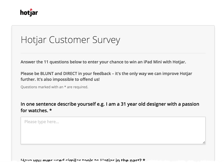
Hotjar’s survey asks customers to be blunt and honest
Interview your team
Talk to your team, specifically anyone who has a touchpoint with the end customer, so you understand their take on your customer’s challenges and motivations. Ask what they think your solution does for the customer, why they chose it, and what the most common concerns are.
You’ll be surprised by their answers, and even more so, how they conflict with what you heard from customers. This is an excellent way to align the team with customer expectations.
Review keywords
Discover what people are searching for and how they find your brand. People now search for long keywords that describe their challenges and problems. Identify those to discover what people are searching for, where they’re landing, and if you answer those needs on each page.
5 Rules of a High-Converting Landing Page Image
Once you’ve completed your research, it’s time to choose the images you’re going to use. Below are a few rules for making sure you choose strong, high-converting images:
1. Reconsider stock photos
Now that we’ve established that images are paramount for your conversions, there’s absolutely no reason for you to keep using stock photos, at least not the ones that look completely fake.
Stock photos reduce authenticity and trust; they can be spotted a mile away, and most importantly, are used by thousands of other businesses. Haven’t we all seen this “businesswoman” image everywhere?
Stock business lady
It pays to invest in original photos and images; Harrington Movers increased their conversions by 45% after removing the stock photo and adding images of their own staff (VWO).
If you do not have the budget to invest in your own photo shoot or images, you can still use stock photos that look more authentic. Not all stock photos are bad and there are some great websites out there with authentic and original photos. A few of my favorite sites include VisualHunt, Skuawk and Gratisography. You can also use this free image sources list and a tool like Canva to edit your photos.
Before choosing a stock photo though, do yourself a favor and run it through TinyEye, to see who else is using the same image.
2. Use images of people
Research indicates that we respond better to images that include faces. We’re hardwired from birth to recognize people, which is why we respond better to faces and human visuals. In fact, the fusiform gyrus is the specific part in our brain responsible for facial, body and color recognition. This is why you should use human faces in your visuals, and the more similar they are to your target audience the better.
A successful image is one that your customers can relate to, someone that looks like them or perhaps someone they would like to be.
Articulate does a great job in using authentic images of people throughout their entire page. From the founder and CEO as the main hero image:
Articulate uses an image of its founder and CEO on the landing page
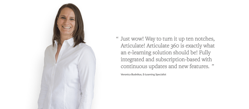
To various testimonials by content customers:
Landing page featuring a testimonial and customer photo
Landing pages convert more with images of real people
They even include an image of their support team:
Your employees are real people!
The connection between the headlines and the people is clear. All images are of relatable people, and this helps you further connect to the brand and its solution.
3. Reduce noise and friction
Since the image we use on our landing page takes up most of our focus and is the first thing people see, we must make sure to remove any noise or friction the image may cause. This includes colors that may distract or other visual objects that have no purpose.
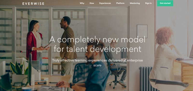
Everwise has a very “loud” hero image, it’s hard to read the text due to the colors and the different objects in the image. In addition, there are no directional cues as to where a visitor should look or what they should click on – everything has the same weight. As we already explained, the images on a page are there to help direct attention toward certain actions and when an image is loud, that cannot be done.
Example of a noisy landing page image
4. Consider the emotional effect of color
There are many different guides on how to use color psychology to increase conversions. While most infographics and blog posts suggest that each color has the same emotional effect on every human being (e.g. blue = trust), that simply is not the truth.
Colors do have an emotional effect on us, but it varies according to 3 components:
- Emotion – We perceive colors based on our past experiences, psychologically and emotionally. For example: for some, blue symbolizes the “ocean,” “freshness,” and “holiday,” while for others “sadness.”
- Symbolic – We associate certain colors with specific objects. For example yellow = sun, green = grass, and blue = the sky.
- Culture – Colors have different meanings in different cultures. For example, in Western culture “white” is considered pure, clean and festive. In Eastern cultures, it symbolizes death and mourning.
To use colors effectively, you must first get to know your customers to better understand their emotions, culture, and symbols. Here’s a complete guide for using color psychology the right way.
5. Copy matters
Images don’t work alone. You may have the greatest visual on the planet, but if it isn’t supported by the right words that speak to your customer’s desires and needs, you won’t see many conversions.
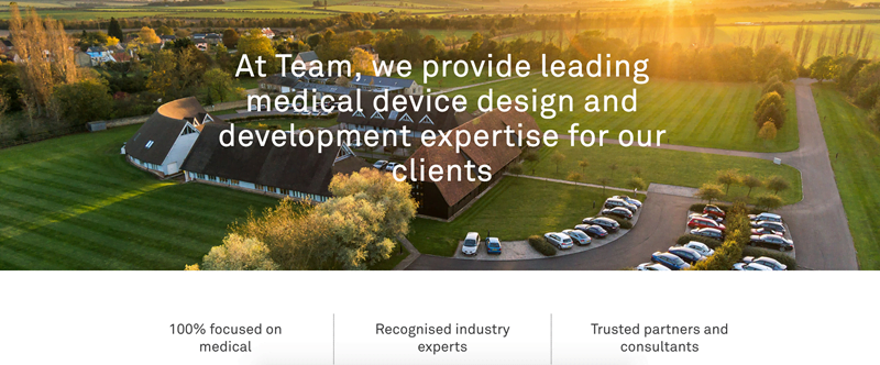
The secret to getting the copy right is similar to choosing an image – make it about the customer. Unfortunately, similar to businesses using the main hero image to highlight their own solution instead of the customer, copy is used in the same self-serving way.
Examples include Team, explaining the solution they provide:
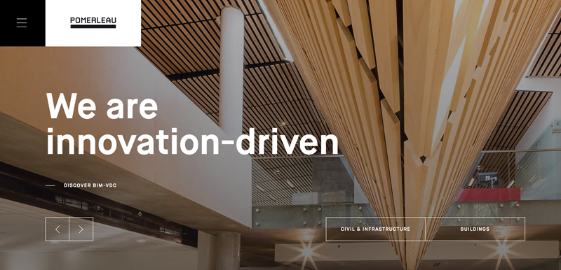
Pomerleau explaining who they are:
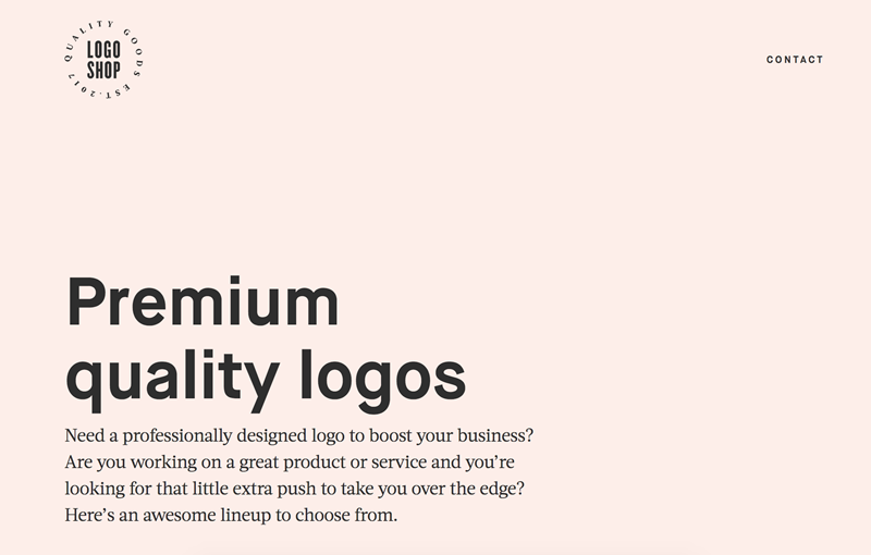
Logo Shop describing what they do:
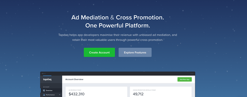
And Tapdaq explaining how their platform works:
All of the examples above have a repeating theme: it’s all about them.
As we’ve already determined, this isn’t what customers care about. What customers care about is what’s in it for them. And that is why it’s crucial to write copy that appeals to your prospect’s emotional triggers.
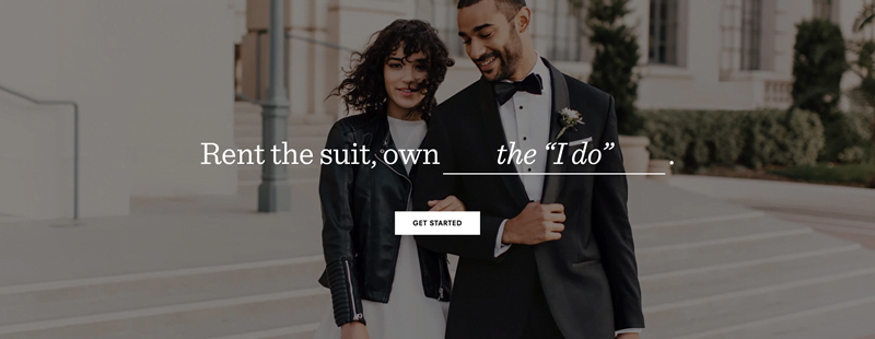
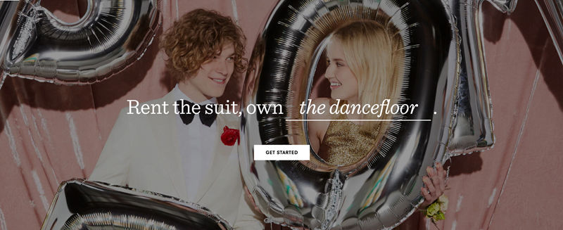
The BLK TUX does a great job pairing their visuals with successful landing page copy:
Your next steps:
Next time you’re sitting at your desk and thinking about that landing page image, make sure you do your research and consider all the different ways you can evoke the right emotion that drives prospects to convert.
What are some examples of landing pages images you’ve seen and liked?
About the author
As founder and chief optimizer at GetUplift, Talia Wolf uses emotional targeting and persuasive design to generate more revenues, leads and sales for businesses. Talia is a keynote speaker, conversion optimization trainer and consultant, and was recently listed as one of the most influential experts in conversion optimization. Follow her on Twitter at @taliagw.









0 Comments