After I published a recent post full of inspiring landing page examples, a couple of readers left some interesting comments about the designs I had featured in the post. In short, the commenters wondered if the types of designs I had included – many of which were minimalistic designs with little copy and a single call-to-action button – would have a negative impact on Quality Score. I thought these comments deserved further study, so in today’s post, we’ll be looking more closely at the issues surrounding these questions, including:
- The role of landing page relevance in Quality Score
- Some examples of PPC landing pages that balance relevance with pleasing design aesthetics
- Whether it’s possible to optimize landing pages for Quality Score in the context of contemporary web design trends
Landing Page Relevance and Quality Score
Unlike some aspects of the mysterious Quality Score “secret sauce,” we know that Google takes landing page relevance into account when calculating Quality Score. Well, technically, Google considers a number of landing page quality score factors, but relevance plays a big role.
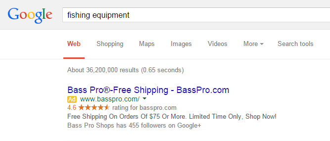
Let’s look at an example to illustrate what this means, using the search term “fishing equipment”:
For me, this ad for Bass Pro Shops was the only result, so unless I want to refine my search query (which I don’t), this is all I’ve got to work with. Although I personally know that Bass Pro is a great place to buy fishing equipment, I don’t know whether the landing page will actually provide me with the gear I want or not until I click on it:
Obviously, landing page quality isn’t off the charts here, but we’re primarily concerned with its relevance to the search query, not how it looks. In this case, since I only searched for “fishing equipment,” it’s actually pretty relevant.
Google doesn’t know whether I’m in the market for a new creel (the basket you hold the fish in, if you’re wondering) or some replacement line, so this page makes the grade.
Now, as you might expect from Google, the definition of what constitutes a good landing page experience is a little vague and can vary widely from one page to another. For example, according to Google, landing page experience is evaluated based on:
- Relevant (determined mostly by the presence of keywords on the page), useful and original content
- Transparency and trustworthiness
- Ease of navigation
- Encouraging visitors to spend time on your site
Let’s look at the criteria above in relation to our Bass Pro Shops example. The content is definitely relevant to my query, and, in the strictest sense of the word, useful to me as a visitor. I’m not sure whether you could call this page’s content “original,” but even if not, two out of three ain’t bad.
Transparency doesn’t really apply here, because the page isn’t asking me to submit any personal information. In terms of trustworthiness, I’d wager that being one of the largest sporting goods retailers in North America probably meets Google’s expectations.
Ease of navigation is questionable in this example. Sure, you’ve got clearly marked product category navigational links on the left, but other than that, it’s a little confusing. For Google’s purposes, these navigational links also serve as keywords, which is primarily how Google evaluates the relevance of landing pages.
If you were to scroll down beyond the visible part of the page in the screenshot, you’d also find these product category images, which definitely hit the mark in terms of user experience and ease of navigation:
So, all in all, this page meets virtually all of Google’s criteria for a good landing page experience. The ad itself also hits the mark, with social and customer review extensions, and an offer in the ad text. The ad doesn’t include my search query, but overall, it’s a pretty good example of a decent ad and a decent landing page to accompany it.
I won’t speculate about what the Quality Score of this particular ad is (though I’d hazard a guess of 7/10 if you pushed me), but this example demonstrates the principles of landing page relevance pretty well.
Is Landing Page Relevance Determined by Pass/Fail Logic?
Now that we know a little more about the role that landing page relevance plays in Google’s evaluation, we need to look closely at Google’s language in its documentation on this process. From the official Google page on landing page experience:
As you can see, with only three possible statuses, it would appear that Google’s approach to determining landing page relevance is pretty rigid.
If you’re a regular reader, you’ll know that WordStream founder Larry Kim is something of a Quality Score nerd (and that’s putting it mildly). Imagine Larry’s excitement when he came across a blog post by British PPC and SEO agency Impression that appeared to confirm that Google applies Boolean (true/false) logic to evaluating landing page relevance in its Quality Score calculations!
As Impression explained in their post, one of their PPC managers found a snippet of code that included the string variable isLandingPageQualityAcceptable. As the only possible answer to a question like this is either “yes” or “no,” it prompted a great deal of speculation about how Google actually evaluates the relevance and quality of landing pages in its Quality Score calculations.
It’s entirely possible that Google actually uses some sort of hidden sliding scale to determine these values. Of course, it’s equally possible that Google secretly employs a vast army of genetically enhanced telekinetic super monkeys to check landing page relevance manually – we just don’t know. Still, this sort of stuff is worth thinking about.
However, I asked Larry what he thought about the role of landing page relevance in Quality Score, and his answer might surprise some of you.
“Landing page quality is a very small component of AdWords Quality Score, and it’s more of a pass-fail kind of thing,” Larry told me. “For example, if you’re bidding on ‘My Little Pony’ keywords and sending those clicks to illegal drug pages, then you fail and your Quality Score is a ‘fail.’ But provided that there is a small amount of relevancy between the keyword/search query and landing page you’re sending people to, you’ll get a ‘pass.’ There are no ‘Quality Score bonus points’ in terms of making the landing page even more relevant. However, there are other reasons that you would want to do this, including increasing conversion rates.”
Landing Page Relevance: Good vs. Bad
So, now we know how landing page relevance factors into Quality Score, let’s take a look at how landing pages (and their matching ads) get it right, how things can go very wrong, and how you can improve your landing page quality score.
Good: Modernize.com Windows
This ad for Modernize.com follows a lot of PPC best practices:
It has a relevant URL, ratings ad extension, a phone number (this is a desktop ad, so it’s not clickable), and navigational links. It also emphasizes Modernize.com’s free, no-obligation quotes, a smart inclusion for this type of service.
The ad’s accompanying product page is also pretty solid:
Obviously there are a lot of variables to consider when buying replacement windows. This landing page is particularly smart as it offers the visitor radio buttons and check boxes to help them choose the windows they want, the type and scope of the project, and their status as homeowners. All the visitor has to enter manually is their zip code. This makes it easy for the visitor to convert. The inclusion of trust signals to the right of the CTA could also help convince hesitant visitors to go through with the quote process.
This landing page is highly relevant in terms of user intent. Replacement windows aren’t the kind of thing you casually buy with one-click purchasing on Amazon, and Modernize understands that visitors that clicked on their ad are most likely shopping around for quotes.
Overall, a highly relevant and well-designed page that is likely to score well according to Google’s landing page relevance criteria.
Bad: Wayfair.com
It’s funny how larger e-commerce sites are often the most egregious offenders when it comes to irrelevant, mismatched landing pages. Case in point, this example from Wayfair.com.
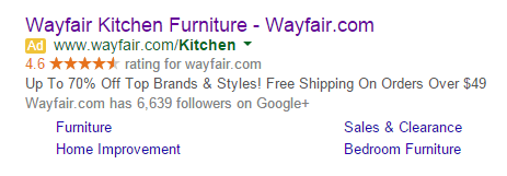
This is an example Wayfair ad for the search query “kitchen furniture”:
It’s not a bad ad by any means. The headline features the exact keyword I searched for (likely through the use of dynamic keyword insertion), and the URL suggests that the landing page I’m about to visit is relevant to my search term. There’s also the review extension, which tells me that a lot of people think highly of Wayfair, and the promise of free shipping on orders over $49 (which most kitchen furniture is likely to be). I’m interested, and so I click on the ad.
Unfortunately, the landing page that accompanies this ad is pretty bad:
Yep, that’s it. That’s the landing page that accompanies the ad above. No furniture to shop, no products of any kind, no navigation – nothing, not even the choice to opt out of this “offer” and continue to an actual landing page without entering your email first.
That “70% off” they mentioned in the ad text? Only available through a daily deals membership system that requires me to give up my email address immediately. There isn’t even any imagery of kitchen furniture on the page. It’s like Wayfair isn’t even trying to give me what I want.
As a prospect, I want to see what kitchen furniture items Wayfair carries, and how much they charge – not sign up for “exclusive sales” on an irrelevant splash page. Maybe the kitchen furniture I’m actually interested in is lurking behind this shameless attempt to get my email address, but I’m in no mood to find out.
Can Contemporary Landing Page Designs Be Considered Relevant by Google?
As I mentioned at the beginning of this post, the idea of examining landing page relevance in relation to Quality Score came from a couple of comments left on a previous post.
One commenter noted that I favored clean, minimal designs. While I do personally enjoy contemporary trends in web design, my choices weren’t solely for aesthetic reasons and the question of relevance is an important one. Although I believe there’s a lot to be learned from the landing page examples in my previous post, landing pages that aren’t perceived as relevant to their accompanying ads by Google could harm advertisers’ Quality Scores.
The question, then, is whether minimalist landing pages can be considered relevant by Google’s standards. Let’s apply Google’s relevance criteria to a real example.
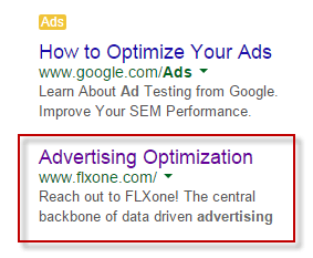
First, I searched for a term that was likely to result in a landing page with a more modern aesthetic, in this case “ad optimization.” There were several ads for major brands like Adobe on the SERP, but I wanted to look at a smaller player, so I went with one of the ads from the sidebar on the right of the organic results:
This is the landing page the ad above took me to when I clicked on it:
For the sake of space, I included as much screen real estate in the screengrab as I could. This content is all above the fold. Some landing pages I featured in my previous post consisted solely of this style of design – a snappy tagline, some very brief explanatory copy, and a single call to action.
Scrolling down this page, however, we find some information that would be more useful to Google’s crawlers:
Sure, the copy itself also aligns pretty closely with contemporary trends, but in terms of what Google’s crawlers are looking for, there’s definitely a lot more to work with. The ad itself isn’t great, and I’m wondering how this landing page impacts its overall Quality Score.
It would be interesting to see how landing pages like this (and the other examples) affect Quality Score, or how Google is adapting its algorithm to take new design trends and user experiences into account when evaluating them. Of course, there’s only so much we can infer when it comes to Quality Score.
Perhaps the best advice would be to take a little from column “A” and a little from column “B” when designing your own pages – by all means use clean, minimal designs if that’s the look you’re going for, but make sure there’s enough real information below the fold for Google to effectively evaluate the relevance of your landing pages so your Quality Scores don’t suffer.
Something else you should probably consider doing is A/B testing two versions of your landing pages. If you’re thinking of adopting a minimalist design, create another more “typical” page and test the two against one another. That way, you’re not making assumptions about the kind of pages your prospects prefer or missing out on potential conversions. This will also allow you to compare hard data on how your various designs impact the Quality Scores of your ads.
What do you think? Should small businesses steer clear of minimalist designs like this, or is there room for contemporary aesthetics on landing pages? Have your Quality Scores improved or suffered after implementing a page with a design like this? I’d love to hear your thoughts.


0 Comments