While having the perfect homepage is more of a dream than reality for most, most marketers believe the quest for a better homepage should never end. After all, your homepage is the digital storefront of your business. You could do your best to entice the by-passers and convert them into customers, like this . . .
Cartier is a French luxury watch and jewelry brand
99Design’s homepage
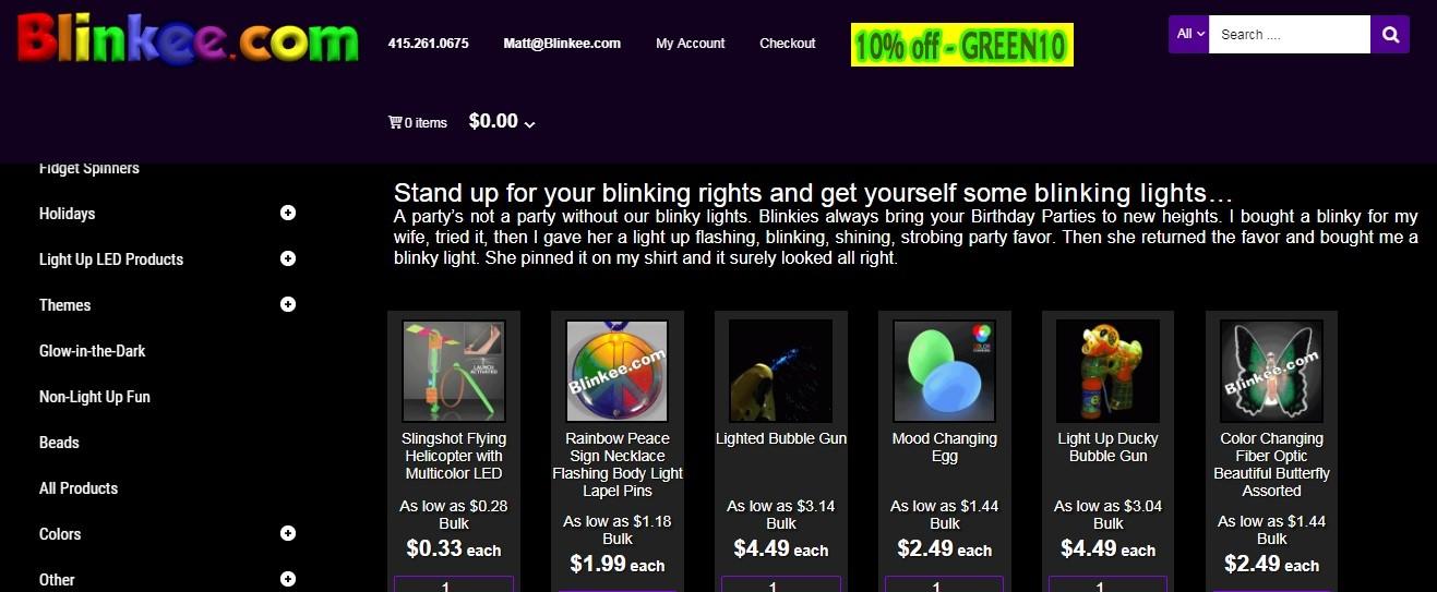
. . . or you can neglect your homepage and drive people away – like this:
Or this:
If you’re a business owner who is determined your products can beat the competition and rise to the top if they are well introduced and marketed, you need to split test your homepage in terms of aesthetics and usability.
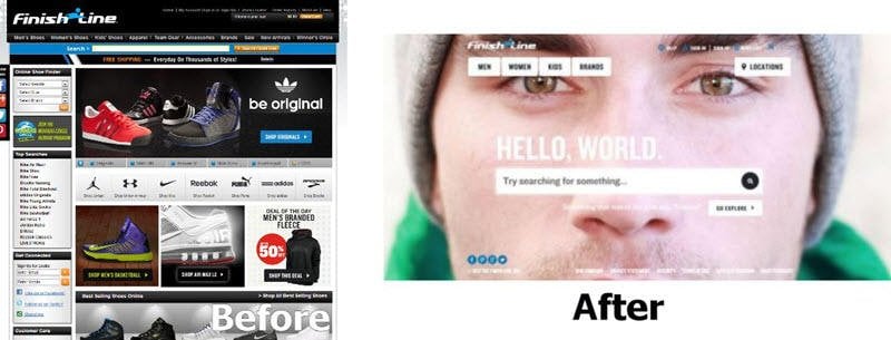
But you know what? It might not be that easy and straightforward. You can’t just jump in there and start your homepage revolution. Some changes to your website might cost you a big loss in sales. Consider Finishline as an example. After making some drastic changes in its homepage (hopefully for the better), Finishline lost $3 million in sales in just weeks. They decided to restore the old version because it resonated better with their users.
The bottom line is that although you can form numerous hypotheses, you need to make sure you invest your resources in true and tested best practices.
This is why I have spent a long time analyzing top business websites’ homepages to find the best practices you can try on your own homepage.
Hang in there and you’ll find out what homepage optimization techniques the leading business websites are using to convert millions of visitors.
What websites did I analyze?
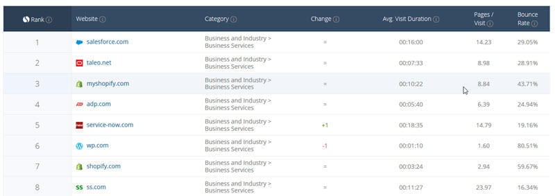
I analyzed the top 50 websites in SimilarWeb’s Business services category and the top 50 websites in its Online marketing category. I dropped the websites that did not have lead generation as their main purpose (e.g. news sites, publications, etc.) and non-English websites, and was left with 50 websites to analyze.
SimilarWeb is a web measurement company that has been offering insights on web traffic and marketing analytics since 2013 according to their about us page.
Disclaimer: I did not have access to the conversion rates, purchase rates or any other performance indicators of the websites I analyzed. However, I take it for granted that these websites spend a lot to acquire their traffic and therefore must put a lot of focus on achieving high homepage conversion rates.
What homepage design variables did I analyze?
I tried to analyze the homepage elements that had the most controversy around them. I answered the following questions:
- How many of the top websites have calls to action (CTAs) above the fold?
- What CTA types are used above the fold?
- How many of the top websites have multiple CTAs?
- Do the websites use any social proof (trust icons, testimonials, case studies, etc.) on their home pages?
- What social proof types are most prevalent among top websites?
- Do they use any videos on their home pages?
- Do they offer any content in exchange for visitors’ email addresses?
The position of CTAs and their types
A study by Nielsen Norman Group in 2010 showed that the 100 pixels just above the fold in a web page were viewed 102% more than the 100 pixels below the fold. The following aggregate heatmap from the study shows the concentration of 57,453 eyetracking fixations.
Red indicates where users looked the most; yellow where they looked less. White areas got virtually no attention. The top black stripe indicates the page fold in the study; subsequent black stripes represent each additional screen after scrolling.
Despite this, a wide range of articles (e.g. ConversionXL, Kissmetrics, Wired) argue that the concept of above the fold might have been misunderstood as “visitors are willing to scroll… as long as they know there’s something to scroll down for” in the words of Joanna Wiebe from Copy Hackers.
Brian Massey also believes that in cases when the homepage is in fact “acting as a landing page” (i.e. trying to sell something), it’s okay to…
“Save the call to action until you’ve made some key points. So if you’re not well known, or if you’re in a new industry and you need to do a little of education first. You could test that, but in general we’ll see a bump if we can move that first call to action to the top.”
My analysis of the top homepages could shed some light on this issue.
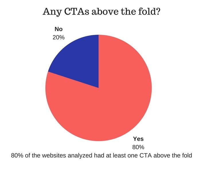
40 out of the 50 homepages analyzed had at least one call to action above the fold (excluding the CTAs in the top menu).
In other words, 80% of the homepages had CTAs above the fold. This might be due to the fact that most companies don’t want to risk losing impatient customers for lack of a clear purpose in the most eye-catching part of their homepages. Fair enough!
Another question to ask is what kinds of CTAs are the most prevalent among the top websites?
To answer this question, I managed to categorize the CTAs into 7 broad groups:
- More info type (including learn more, watch now, find out more, read more).
- Sample type (free account, free trial, try it for free, get started, demo, get a demo).
- Download type (app, get report, guide, get now).
- Join type (publisher sign-up, register, secure my seat, become an affiliate/advertiser).
- Buy type (see solutions/plans/products, compare plans).
- Contact type (including let’s connect, contact us, schedule a meeting).
The following chart shows the distribution of these CTA types among the analyzed webpages.
- 22 out of 50 (44%) of the websites had at least one more info type CTA above the fold.
- 21 out of 50 (42%) of the websites had at least one sample type CTA above the fold.
- 8 out of 50 (16%) of the websites had at least one join type CTA above the fold.
- 6 out of 50 (12%) of the websites had at least one buy type CTA above the fold.
- 1 out of 50 (2%) of the websites had at least one contact type CTA above the fold.
- 1 out of 50 (2%) of the websites had at least one download type CTA above the fold.
It seems that the “More info” type of CTA is the most used CTA type among the top websites (44%). However, you need to know that only 9 out of 50 (18%) websites had the “More info” type as the only CTA above the fold. This means that the majority of top websites are using the “More info” type as a complementary CTA to help convert doubtful visitors.
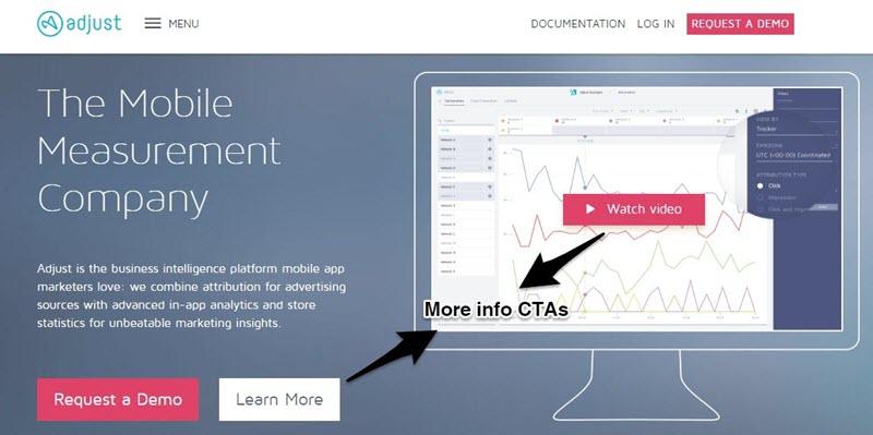
Adjust, a mobile analytics company, could be a good example. Two “More info” type CTAs persuade viewers to request a demo.
It is also noteworthy to mention that 47 of the 50 websites analyzed (94%) have various CTA types in the whole homepage. This runs against the advice to incorporate only one singular CTA in the whole page.
The only websites that have one CTA type in the entire home page (excluding the header and footer) are v2profit.com, techtarget.com, and cpabuild.com. Even among these three, techtarget has multiple CTAs but all of them belong to the more info type (there is also one prominent contact type in their footer).
The reason behind this might be that websites are willing to cater to different user intents rather than just one user intent. In other words, by using different CTA types on their homepages, the top websites try to elicit an action from any kind of visitors.
Combinations of CTA types
I was also curious to know which combination of CTAs were the most preferred among the top websites.
My guess was Buy + More info types were more prevalent because it made sense to me that websites should use a More info type in order to add the element of persuasion when offering to sell their products.
But then came the bittersweet revelation. Only 2 out of the 13 web pages that used More info CTAs in combination with other types used a Buy type alongside a More info CTA.
In fact the most common combination of CTAs was Sample + More info (8 out of 19) which would come as a surprise as free trials and demos are themselves intended to remove the risk barrier and persuade people to buy.
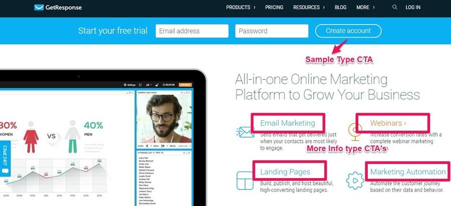
GetResponse’s homepage offers 4 different more info CTA’s to persuade visitors to start a free trial.
It seems that the top websites tend to avoid offering their products up front. Instead they spend some time to educate their visitors and make sure that they are the right fit for the purchase.
Rand Fishkin explains the reason for this tendency by revealing how Moz’s visitors convert:
“Moz customers that convert on the first, or second, or third visit to website tend to leave early and often. They tend to be not longstanding, loyal customers who have low churn rates and those kinds of things. They tend to have a very high churn and low retention.”
To shirk away from such customers, Moz takes up a strategy: people normally visit their website 8 times before they sign-up for the free trial. And Rand states clearly that for them there is a strong correlation between the time spent on the website and customer loyalty.
Insights to take away:
- Have a clear CTA above the fold. 80% of the websites analyzed have at least one CTA above the fold. Although it is argued that above the fold is a myth and that people tend to scroll down the page, it is a good idea to include at least one CTA above the fold.
- Have a few CTA’s to catch any kind of visitors’ attention. 94% of the websites analyzed had more than one CTA type. Using only one CTA type in your homepage might limit the functionality of your website. Try to cater to different user intents by incorporating various CTA types in your page. But obviously, overdoing this might have negative impacts as it might confuse your visitors.
- Educate your visitor using more info and sample type CTA’s: The “More” info CTA type is the most prevalent above the fold. It is quite tempting to include a Buy CTA above the fold to have as many buyers as possible. But, as counterintuitive as it seems, early conversions are not always healthy conversions. Try to engage your first time visitors by including more info or sample CTAs above the fold.
Types of Social Proof on Homepage Designs?
Using social proof is a great way to earn your visitors’ trust. But like any other elements on a homepage, you need to know how to use social proof to your advantage.
There are basically 6 social proof types:
Case studies: You could mention the detailed success story of your clients.
Testimonials: You could use recommendations from your happy customers.
Reviews: You could feature real reviews of your products or services by trusted sources.
Social Media: Showing how many followers you have or showing their positive posts about you is a good way to gain new visitors’ trust.
Trust Icons: You can showcase the logos of the companies you’ve worked with or the publications you’ve been featured on.
Data/Numbers: If you have worked with an impressive number of people or have achieved impressive results with them, you can show the data/numbers on your homepage.
Overall, 41 out of 50 top websites analyzed use at least one example of social proof in order to garner trust in their visitors. That’s 82% of the websites.
The most frequently used social proof type among the analyzed websites is trust icons. 27 out of 50 of the websites (54%) use trust icons to gain their visitors’ trust.
The second place belongs to testimonials. 25 out of 50 websites analyzed (50% of them) use testimonials on their home pages.
Case studies are the next popular social proof type with 14 out of 50 (28%) of the analyzed websites using them.
And finally we have reviews and social media with 2% of the websites using each one of them (that’s 1 website for each).
GetResponse’s home page has almost all the social proof types.
It seems that Trust Icons have the most users among the top websites. I guess these are the reasons why trust icons are more popular than other social proof elements:
- They are visual and are easier to remember.
- They don’t demand as much work as other kinds of social proof, especially case studies.
- They are positive social proof. As opposed to negative social proof that emphasizes on the number of people who don’t do a particular action, positive social proof highlights how many people do something and is more influential.
- They are more authoritative because they are hand-picked to represent the greatest achievements of the website.
It’s also important to know that Trust Icons are mostly used in combination with other social proof types. Only 2 out of the 27 websites that use Trust Icons use them as their only social proof type. The other 25 use them in combination with other social proof types.
Nearly on a par with Trust Icons, Testimonials are the second most used social proof types on the home pages. A word from the real users of a product is more effective than self-proclaimed honors.
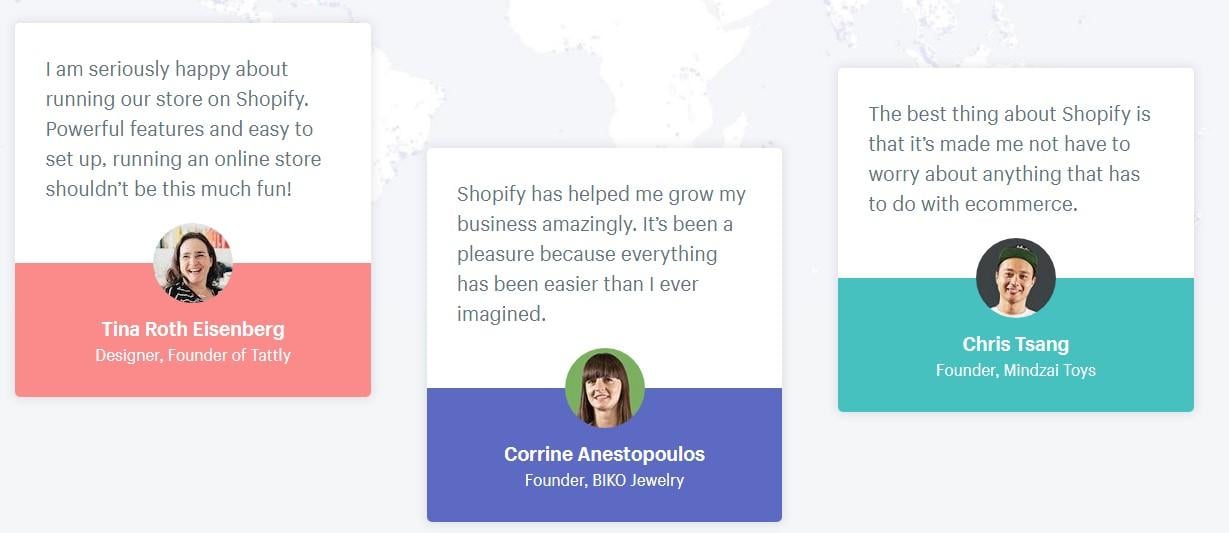
These three testimonials are featured on Shopify’s home page. They focus on the fact that Shopify is an easy-to-use, hassle-free ecommerce software.
The third most popular social proof type is Numbers/data. It could impress your visitors to know how many clients you’ve served or how many issues you’ve resolved, and it makes them quite confident in your expertise and experience.
Impressive numbers/data social proof on Moz’s homepage
Case studies occupy the fourth place. They are engaging and clearly explain the process of how you could solve your client’s problem. Spend some time to form a clear-cut narrative that your potential customers can relate to, and be specific in numbers, data, etc.
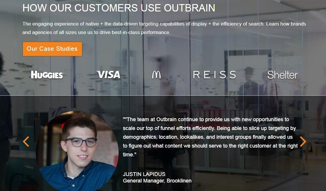
OutBrain is one of the 14 websites that use case studies on its homepage.
The Insights to Take Away
82% of the websites analyzed used at least one social proof type on their homepages. This makes social proof a standard practice without which there is a big hole on your homepage.
The three most commonly used social proof types among the top websites are trust icons, testimonials, and numbers/data. Case studies are also popular but I assume most websites preserve them for their landing pages and sales pages as they are more detailed, demand more space, and have a persuasive force before the purchase.
For introductory purposes and building trust, trust icons, testimonials, and numbers/data are perfect.
The question is how to make social proof more authentic? Here are some ways:
- Use pictures of the people who give testimonials or get featured as case studies. One study shows that using a picture could increase people’s acceptance of a claim.
- Be more specific about the person giving the testimonial: Mention the person’s name, company, role, and if possible a link to their website or twitter handle.
- Feature someone your visitors know well and can relate to: Don’t just use anyone, if you can help it. Testimonials and case studies work better when they come from brands or people that are well-known in your industry.
- Use Videos. It goes without saying that videos are often more believable and engaging than text.
- Avoid the general and be specific: A good testimonial or case study highlights a benefit, explains how the benefit solves a problem, and is specific in the achieved results.
- Link to off-site reviews: People know that you’re only featuring a handful of positive reviews on your website. If you link to the reviews on another website, chances are people will trust you more.
Videos on the Homepage
While some people advise against autoplay background videos on home pages, I think the click-to-play videos that function as “more info” CTA’s can be effective.
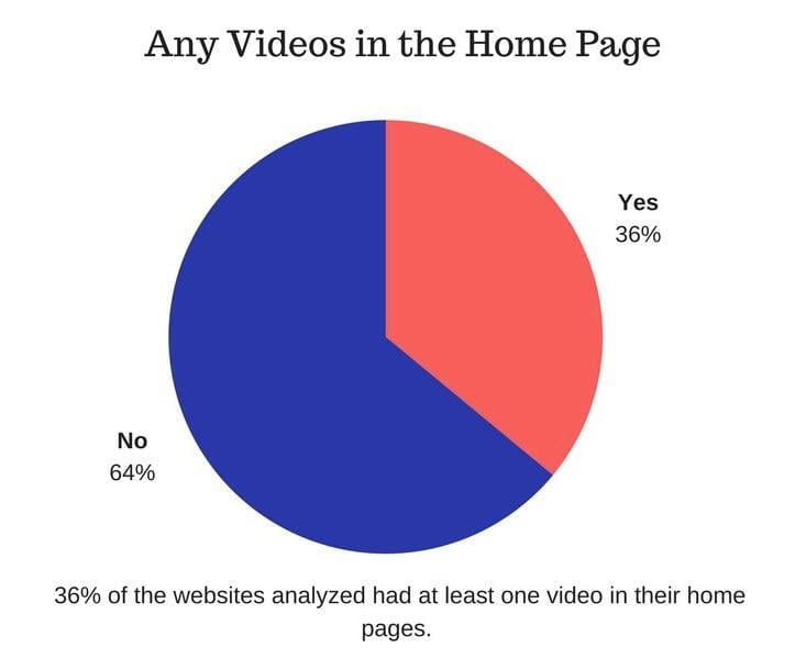
18 out of the 50 websites analyzed had at least one video on their entire homepages. That is 36% of them.
With all the buzz about video and its being the future of marketing, I expected to see a greater number of top websites using videos on their home pages. I was disappointed.
I think most of the websites are preserving the persuasive force of video for their landing pages and sales pages when people are more educated about their products. Videos seem to be more emotional rather than educational and are ideal for landing pages and sales pages.
Or maybe they consider using videos on their home pages distracting, especially when they intend to produce as many leads as possible. Copy just seems to work faster.
Content Offers on the Homepage
The last home page element that I analyzed is content offers.
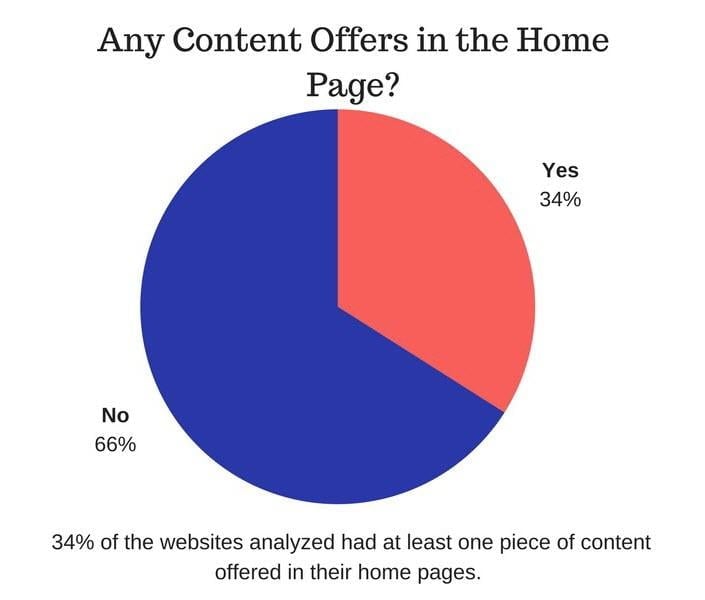
17 out of 50 websites analyzed (34% of them) offer at least one piece of content (ebook, report, webinar, etc.) that demand signing up.
This is a great way to prove your authority and generate more leads from a static page.
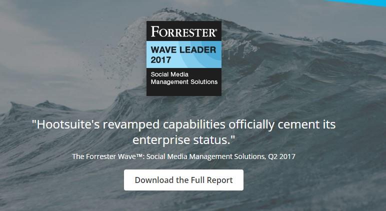
Hootsuite offers Forrester’s study as a downloadable piece of content on their home page.
See if you can increase your opt-in rate by offering content on your homepage. Industry reports, comprehensive guides, and webinars are great content offers.
7 Key Takeaways from My Homepage Design Analysis
After analyzing the home pages of the top 50 websites from SimilarWeb’s “Business Services” and “Online Marketing” categories, I found the following (check out the details, graphs, and the insights above):
- 80% of the top websites have at least one CTA above the fold.
- The most commonly used CTA type above the fold is “More Info” (including learn more, watch now, find out more, read more).
- The most commonly used combination of CTA’s above the fold is “More Info” and “Sample” types.
- 82% of the top websites used at least one type of social proof on their homepage.
- The most frequently used social proof types are “trust icons” (54%) and “testimonials” (50%).
- Only 36% of the top websites used videos on their entire home pages.
- Only 34% of the top websites offer content (ebooks, white papers, webinars, etc.) in exchange for people’s contact information on their home pages.
I’m not suggesting you should blindly follow any of these practices. On the contrary, I’m providing a framework for further testing. As Sam Ovens says only practice makes you self-confident.
Now that you know most of the top websites are seeing results from avoiding instant purchases by offering “More Info” and “Sample” type CTA’s first and foremost, you need to test this on your website.
Figure out if most of your churn rate is coming from the people who have purchased instantly, or the people who have been educated by your content first, and see if you need to spend more time on educating your visitors before the purchase.
Hopefully, having a tentative idea of the best homepage designing practices could help you figure out a way to increase your healthy conversions.
About the author
Mostafa Dastras is one of those people who think talking about themselves in third person is weird (but he’s cool with it). What keeps him up at nights is how he can help his clients increase sales with no BS content marketing. Visit his blog, LiveaBusinessLife, or connect with him on LinkedIn to get him to write for you.







0 Comments