Picture it: Your boss just gave you permission to go to a conference in, say, Hawaii. Amazing! What a dream come true that your company will pay for your flights and hotel to paradise. So you google the event and try to find where to sign up—and when it’s happening again and which hotel they recommend booking. But instead of finding a one-stop shop full of answers, you have to click and click to get all the information you need.
That won’t do.
Event landing pages, like general lead generation landing pages, need to be compelling and scannable. For event marketers, the event landing page should be designed specifically for your needs—which means that all event landing pages should be designed to compel visitors to register for your event or sign up for post-click events, i.e. a page for people who engaged with your company at an event.
But the best event landing pages—to drive registrants or post-click actions—are designed to compel visitors to act now.
Here are seven examples of great event landing pages, plus how you can copy these techniques to create your own high-converting pages!
Basic requirements for all event landing pages
Before we dive into some stellar examples, it’s good to lay some groundwork. You need to know the basic requirements before you can go above and beyond, after all.
To get started, think about your event landing page as an invitation to a party you’re throwing or trying to convince your friends to go to. What information do people need to know? What details would you need to include?
- The who: That would be you, the host. Who are you and why are you an authority on this topic or hosting this event? Alternatively, if you’re an affiliate or sponsor of the event, why are you attending and/or encouraging other people to register as well? If you’re the host, do your sponsors a solid and throw their logos up. It’s just good manners.
- The what: As in, what is this event all about? Conferences can be hyper-focused on a niche topic, like, I don’t know, how to create a great event landing page. Or they can be broad and come with lots of bells and whistles, like SXSW. Make sure you tell your audience what to expect.
- The details: Where and when is the event? You don’t need to get as specific as the actual address, but make sure to include the city. These details should be featured prominently on your landing page, probably right next to a CTA.
- The CTA: Speaking of CTAs, your landing page will need at least one. Maybe multiple, actually. If your event landing page has to pack in a lot of information and users will be scrolling through it, make sure they can navigate to a CTA to get their tickets at all times. You never want someone to have to work to give you money.
There’s another huge requirement for your landing page that isn’t information to include—it’s your event landing page’s shareability. When was the last time you booked concert tickets solo? Everyone wants to go to cool events with their friends. Make it easy for them.
But what do great event landing pages look like?
So we’ve compiled a list of both types of event landing pages—registration and post-click—to show you how to make the best landing page to make your event marketing even more successful.
1. Dreamforce
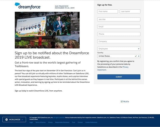
When you look up Dreamforce 2019, you land on a page that announces the conference is sold out—but you’re not completely out of luck! You can still register for the live stream or with a code. So, when you click through to the live stream option, you can actually register for free.
How to do it like Salesforce: First of all, shout out to Salesforce for keep the main page up after tickets were sold out. This is a pretty large event, so the landing page experience is deep. But check out the navigation at the top, which includes “Why Attend,” “Schedule,” “FAQs,” and prominent calls to action in the upper right corner. As you scroll down the page, you can get all the information you need to click through to Dreamforce LIVE registration, which looks like this:
The registration page is pretty basic since it’s free, but it includes all the information you need and a quality image (from the year prior, if you have that) to show that it’ll feel just like you’re actually there.
2. CTA19 (Call to Action Conference by Unbounce)
Unbounce is an expert when it comes to landing pages (they have these great templates you can use), so it’s no surprise that their event landing pages are great. Like Dreamforce, this event is well attended with a solid marketing team full of landing page experts to make this event page.
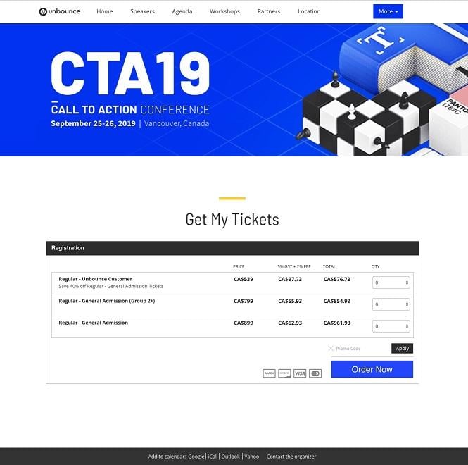
Before you click through to this page, the event “homepage” is full of all the info you need to understand what the event is about, when and where it is, and why you need to attend. “Get My Tickets” is prominently located and directs you to this simple page where you can select your ticket and head to the check out.
How to do it like Unbounce: Create a unique footer for your event landing page. There, you can let your attendees add this event to their calendars right from the landing page or contact you directly.
3. Mobile Apps Unlocked by Grow.co
MAU by Grow.co is particularly interesting because it incorporates an element of elitism—you can’t just purchase tickets; you need to apply to attend. You have to be a service provider or an app marketer to get in, which is the first CTA you have to conquer on this page.
When you scroll down, there’s a simple form to fill out about who you are and what you do. You can also easily access the speakers, sponsors, and agenda from here.
How to do it like Grow.co: Add an element of exclusivity. (Do people still say “FOMO”?) Though this isn’t my favorite landing page, it’s a great tactic to take if you’re hosting a popular event with limited space, like a pizza-making class specific for food bloggers. Everyone loves pizza, but you can’t take just any type of blogger.
4. Social Media Marketing World by Social Media Examiner
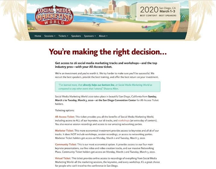
The event landing page for Social Media Marketing World—what a mouthful—is very on-brand for Social Media Examiner and includes a lot of text. Not a bad thing! When you click through to register, the page explains what kind of tickets they offer, broken up with glowing reviews from past attendees, and the banner at the top clearly tells you where and when it will take place.
As you scroll, you’ll be able to easily select the type of ticket you want, and they even offer you an email template to send to your boss that will help convince them to let you attend the event. Talk about shareable.
How to do it like Social Media Examiner: Break it down for your attendees. Let them know exactly what they’ll be getting if they book tickets for your conference or event right on the landing page. The most frustrating thing is to have to keep searching for information.
5. South by Southwest
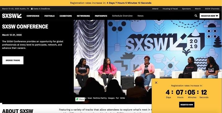
SXSW is one of the most popular conferences/festivals of the year, which makes it no surprise that their event landing pages are pretty in-depth and comprehensive. Something they do a great job conveying? Urgency. Look at all that yellow text and the countdown clock!
The navigation is packed with information for registrants with details on the where and when, plus sponsors, merch, a registration CTA, and other resources.
How to do it like Southwest: Add some bold colors and countdown clocks, especially if you’re planning a price drop or hike. If not, you can tease urgency by saying, “limited quantity left!”
6. Affiliate World Asia
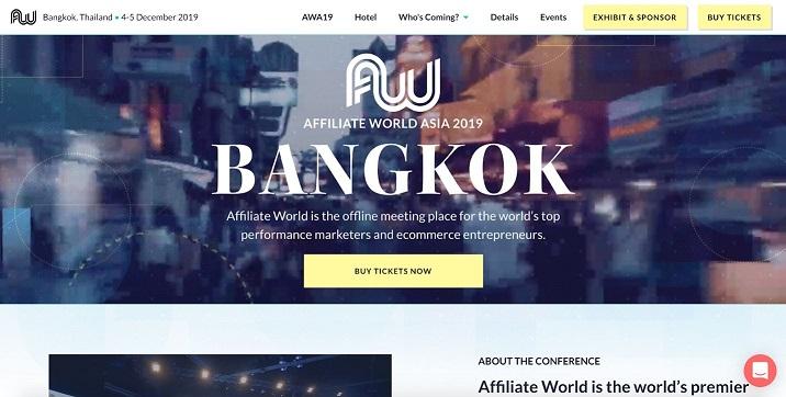
Affiliate World is a big conference circuit for affiliates, affiliate networks, and performance marketers/entrepreneurs. As soon as you land on their event page, there is a big yellow button telling you to buy tickets now. You can’t tell from the screenshot, but it also has a nice video of Bangkok in the background.
While the call to action is great and featured twice above-the-fold, I’m a big fan of the chatbot here. You can send a message to the Affiliate World team (apparently, they answer in a few hours), which is a nice way to direct registrant questions to the people organizing the event.
As you scroll through the page, you’ll see who is speaking, more “buy tickets” CTAs, and some infographic-y stats about the connections made at past conferences. When you click onto the registration page, there is an imminent price increase for passes, which urges you to register right now!
How to do it like Affiliate World: Double-check those CTA placements. Don’t make your registrants dig for their tickets, you want the check-out button to be the most prominent feature on your event landing page.
7. Honorable Mention: EventBrite
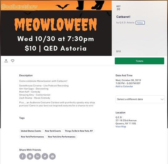
EventBrite gets a shout-out because the platform makes it so easy to advertise your event and sell tickets. They have a basic template, where you can fill out all the necessary information, share the page with your friends, see similar events from the organizer, or find other events you might like.
Who wants to celebrate Meowloween with me?!
How to do it like EventBrite: Stick to the basics—and make sure your event is appealing (or punny enough) to bring in those registrants.
Get more attendees with great event landing pages
We hope these tips were helpful for building your next event landing page! Let us know if you’ve seen a particularly compelling event landing page recently, or if you’ll be heading to Meowloween …




0 Comments