Landing page forms are one of the most important parts of a landing page, but so many advertisers get them wrong. Web forms on landing pages are often subject to “Goldilocks syndrome.” Too long, and you risk deterring prospective customers from converting. Too short, and you may not gather the information you need to qualify visitors as worthwhile leads.
Like Goldilocks and her pilfered porridge, they have to be just right.
The face of a thief.
In today’s post, I’ll outline seven ways you can improve your landing page forms to make them attractive to prospects and give you the data you need to qualify your leads. For more info on how to apply these tips for social, check out this post on Facebook landing pages.
1. Only Ask for Information You MUST Have
Many marketers, especially B2B software companies, ask for way too much information in their landing page forms. Let’s look at this example from an enterprise datacenter provider:
Now, don’t get me wrong – I realize that, for this kind of web form (that asks prospects to provide information to schedule a software demonstration), the company needs to know the visitor is serious and won’t waste their time.
However, this is asking for way too much information. Seriously, I’ve applied for credit cards that asked for less information than this.
A Need to Know Basis
When designing a web form, it’s crucial to achieve the balance of requesting enough information from the user to qualify them as a valid lead or prospect, without asking them to essentially hand over their identity. Generally, after 7 fields in a landing page form, conversion rates start to drop off steeply.
Using the example above, let’s take a look at what we could trim from this form. For starters, do you really need to know what state and country they’re in? Sure, time zone differences are an issue you have to deal with during product demos, but at least make these fields drop-down menus if you have to have them.
The same principle applies to the Title field. I understand that you’d probably want to demo your software to someone with the authority to make a purchasing decision, but this could be easily determined by the information in the Role in Company field.
This company offers enterprise-level cloud storage datacenter solutions. As such, it’s highly likely that a prospect’s “cloud interest” will be for these services. Why else would they be thinking about requesting a demo? This is a completely meaningless field that serves no purpose. Get rid of it.
2. Don’t Be Afraid of White Space
So, now we know that you should ask for information from your prospects sparingly, we need to talk about how your form actually looks on your landing page.
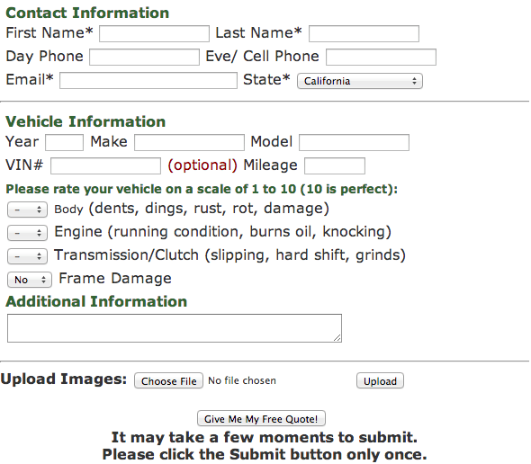
Even if you’re only asking for a little information, your landing page form still needs to be aesthetically pleasing. This means not cramming what few fields you do have right next to one another. Give your web form some room to breathe. It’ll make it less intimidating to the user, and will look nicer overall.
Please don’t do this.
3. Spend Time Crafting the CTA
The call to action is one of the most important parts of a landing page form. Without a strong CTA, your prospects may wonder why the hell they’re handing over all this personal information in the first place. A strong CTA, on the other hand, will reinforce their desire to get their hands on whatever you’re offering and make sure they cross the line and convert.
Focus on the Benefits
Creating a compelling CTA is about more than using persuasive language (though it definitely helps). Consider the benefits of your offer to the prospect, and then focus on these benefits in your CTA. The more strongly you can reinforce what visitors stand to get out of your offer, the more likely they are to convert.
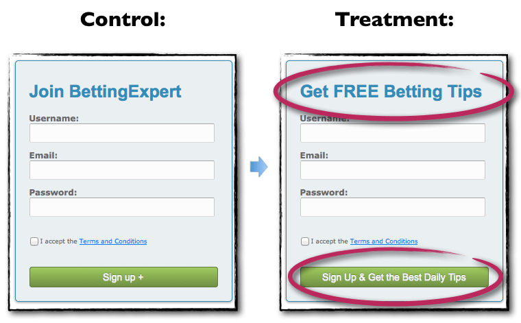
Let’s take a look at an example of a good CTA, versus its bland, boring predecessor:
Which of these forms is more compelling? Why would I “join” or “sign up” for something, when I could get FREE stuff? Similarly, the CTA button itself makes it clear what I’ll be getting by signing up, whereas the control version doesn’t offer any hint of what to expect at all.
Here’s another example of (two) great CTAs:
Even without the “I want to…” above them, the benefits and desired outcomes of selecting either option are clear. The unspoken “I want to” rule is a great starting point for writing your calls to action – make sure that, whatever your CTA is, it could be prefaced by “I want to…”
Both of these examples are very clickable, make the benefits clear, and leave nothing to suggestion.
4. Use Radio Buttons to Minimize Typing
People are lazy. They want to do as little as possible to accomplish their goal – so leverage their laziness and make it even easier for them to convert by including radio buttons.
Radio buttons work very well for situations in which there are only a few options, or entering the data manually would be tedious for the user.
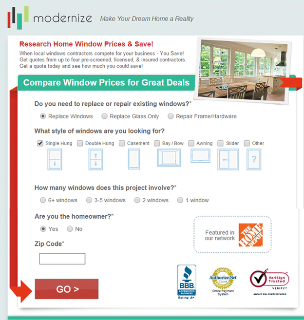
Let’s take a look at a particularly good example of radio buttons being used on a landing page form:
In addition to making it as easy as possible for the user to enter quite a lot of information, the inclusion of radio buttons on this web form mean that the only data the user has to enter manually is their zip code. Very clever, and this makes for a rather attractive form overall.
5. Use Directional Visual Cues
You might think it’s obvious what users should do if they want to sign up for whatever you’re offering, but users rarely do what you want them to do unless you make it painfully obvious.
Even if you’ve included your web form above the fold, used plenty of white space to make it attractive, and ask for the bare minimum of information, you could still risk losing them before they cross the line and convert. Why not make it even more obvious where they should enter their information by using visual directional cues to help them along?
You Can NEVER Make It Too Obvious
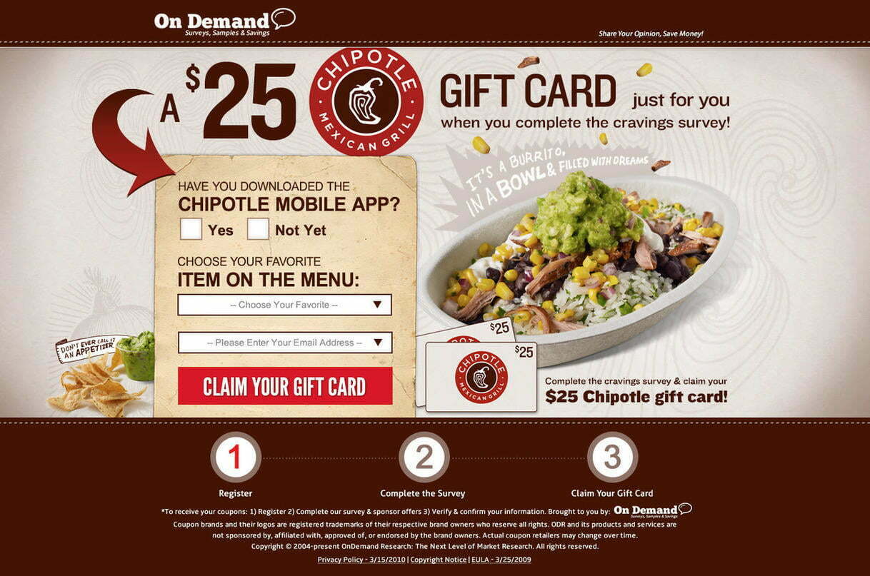
Check out this landing page form for a free gift card for Chipotle.
Chipotle is taking no chances with this web form. Not only is there a large, helpful arrow pointing to where hungry visitors should claim their free gift card, but they’ve also included simple yes/no checkboxes and a drop-down menu in the form itself. All the user has to enter manually is their email address.
Of course, this is just the first step users have to complete, as shown by the 1-2-3 graphic at the bottom of the page, but as an example of how to get users to complete a web form, it works pretty well.
Line of Sight Cues
Another technique you can use to accomplish this is line-of-sight. Including an image of a person looking at the landing page form you want the user to complete is a more subtle, yet still effective, way of drawing the user’s attention to the form, as this example from dating site Chemistry.com achieves to great effect:
However, while the use of a line-of-sight visual cue is very effective in this example, the web form itself is actually rather poor. It asks for a lot of information, as it’s attempting to get users to create a dating profile directly from the landing page. The form itself is pretty cramped (an unfortunate byproduct of the design choices they’ve made with the thought/speech bubble motif they’re using), and the CTA is weak.
6. Design Your Landing Page Forms for Mobile
I can’t stress this one enough. SO many marketers ignore web forms on mobile in the assumption that “people don’t complete web forms on mobile.” This might be true to an extent, but it’s not a limitation of mobile devices or the fact that people don’t want to sign up for stuff when they’re on the go, but rather a design problem.
Too many businesses design their web forms for desktop and leave it at that. If you’re doing this, you’re missing out on HUGE opportunities to convert mobile visitors. You absolutely HAVE TO design your landing page forms to be mobile-friendly, whether this is using responsive web design or designing an entirely separate mobile landing page altogether.
Consider User Behavior
Now, you might not be able to optimize certain web forms for mobile. Put another way, you have to consider user behavior and how people use their mobile devices, and the objectives of your web forms. You’re probably not going to be able to include a 10-field landing page form asking someone to sign up for a software demo on mobile – it’s just too much.
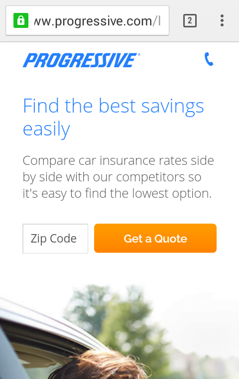
You may, however, be able to ask someone to sign up for a newsletter, get a quote, or take another action that requires less information, like this example from insurance provide Progressive does:
All the user has to enter to begin the quote process is enter their zip code. Cleverly, there’s also a clickable “call” icon at the top of the page, so if the user doesn’t even want to enter their zip, they can call an agent directly. The CTA button is also bright and obvious, a mobile landing page design best practice, and the page itself aligns perfectly with the desktop version of the page, which looks like this:
Sure, you’re not going to capture many leads for a software demo or get users to part with a ton of data, but by designing for mobile, you’re at least capturing more potential leads and growing your business.
7. A/B Test Everything
It’s no use following the previous six tips if you’re not going to rely on cold, hard data to make your final decisions. You know what they say about assumptions!
It’s crucial to A/B test every aspect of your landing page forms before settling on a final design. Take the directional cues example above. WordStream tried including images of actual people on a landing page in one test, only to discover that our audience didn’t respond well (at all) to them. We removed them in a separate design, only to find that our conversion rates improved considerably. As such, the advice above wouldn’t necessarily apply to us and our audience, just as it might not apply to you.
You’ll find seven options for A/B testing and other landing page tools here.






0 Comments