You wouldn’t be the only business to experience contact forms going stale: just 22% of businesses are happy with their conversion rates, which means the majority of us have plenty of room for improvement.
So why isn’t the traffic we’re driving to our website actually converting into high-quality lead form submissions?
The answer isn’t necessarily a problem with products, services, or offerings.
In fact, there are several factors on the form itself that could influence the volume of conversions you’re getting—ranging from your page layout to a form that’s too complex.
Here are six simple tweaks to boost your form conversion rate and encourage those high-quality leads to convert.
1. Use image select questions
Have you ever exited a lead capture form because you felt too overwhelmed with the number of fields you needed to enter?
While it’s wise to collect information from your audience such as job titles (especially if you’re a B2B company) and locations, it’s not absolutely essential—and it could put off users from starting to fill out your form.
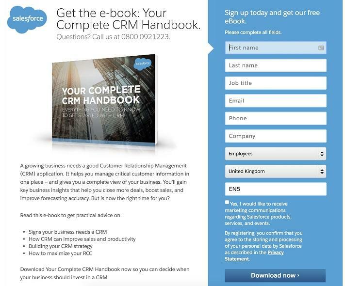
Think about it: If you’re filling in a form to receive a free ebook, you only really need a person’s first name and email address. If they’re greeted with a 15-field form that asks for their location, LinkedIn profile, and company size, they’ll need to invest a huge chunk of time clicking around before gaining access. Just check out the example below:
The above example from Salesforce already feels daunting. And while I’m sure an organization their size has tested this extensively, many of us can’t afford that luxury.
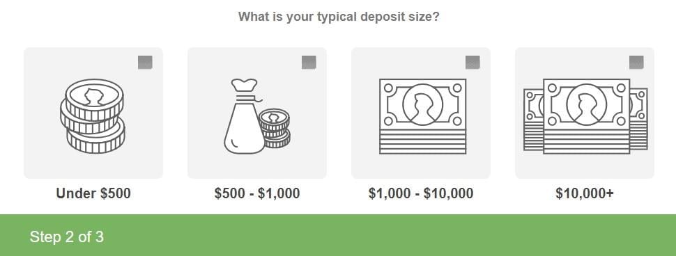
A fantastic workaround to this problem is to use image select questions.
In the example above, the form requires 13 clicks in total (including the CTA and T&C checkbox). With image select questions, you can create forms that require as little as three clicks. This means the time (and effort) investment you need from your audience is slashed dramatically.
We tested this concept on the home page of our online broker comparison website, BrokerNotes. The website uses a tool to segment online traders into different buckets. We initially used dropdown question types to do this; however, by using image select questions instead, we managed to gain an impressive 54% conversion rate from our lead capture form:
Not only do the images make the form look more appealing, but our audience also needs to click just three buttons before finding a suitable broker. This makes for a more convenient experience for our audience.
Ask yourself, is there a way I can entice more engagement and form completions? How can I make my lead forms more enjoyable? Consider using images to capture attention and illustrate complex ideas, just like we do at BrokerNotes and Leadformly.
2. Harness data to pre-fill answers
Also known as “smart forms” or “intelligent forms,” this form submission trick takes the data you’ve already collected on your prospect, such as:
- Their name
- Their current location
- Whether they’re already a customer
And then it automatically pre-fills required form fields!
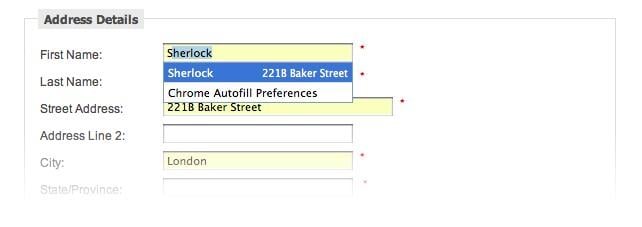
Here’s how it looks in practice:
Notice how intelligent lead capture forms will take significantly less time to fill in because the majority of fields have already been entered?
That’s bound to lead to more clicks and a higher submission rate. In fact, SaaS brand IronMountain tested this approach and found it increased the number of leads by 140%.
The same concept applies for social logins, too—like this form on Canva’s sign-up page:
If customers are able to skip a sign-up form by hitting a “Sign in with Twitter” button, it further lessens the number of clicks (and therefore the time) they’ll need to invest in the form.
That’s why websites using social autofill can improve form conversion rates by up to 189%—a change I’m sure you’d love to see.
3. Opt for a single-column lead capture form
Earlier I mentioned how complex and overwhelming forms can cause friction and leads users to bounce. Multiple columns can exacerbate this problem.
Why? Because single columns look more digestible and easier to tackle than multi-column alternatives, making people more inclined to fill in the form.
Granted, it’s a simple trick—but one that works. In fact, one study found that single-column forms are completed 15.4 seconds faster than multi-column alternatives, proving your audience can take action without investing a huge chunk of their day into completing a form.
This video from Baynard Institute demonstrates exactly how easy it can be to confuse users with multiple columns:
Exitbee has a fantastic example of how you can create single-column forms without compromising on fields:
Although they’re asking their visitors to fill in five fields (more than the name and email information they need), it looks manageable—purely because it’s organized in a way that’s easy on the eye.
4. Rethink your call to action
You likely already know the importance of a call to action. But don’t fall into the trap of using generic words like “buy,” “download,” or “submit.”
To put it simply: Those words are boring. More importantly, they don’t always have enough power to convince people to take action and complete your lead capture form.
Instead, use targeted words or phrases that are relevant to the form you’re asking people to complete—like this example on Netflix’s website:
Netflix wants people to sign up for their service, but instead of using “sign up” as their call to action, they’ve given people a reason to: because it’s free.
FreshBooks uses this concept in the form on their homepage, too:
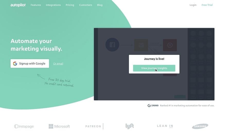
Using social logins as your primary call to action can help reduce anxiety and build trust. This is exactly what Autopilot does on their home page:
As you can see, users can sign up using their Google account. With this sign-in option, Autopilot is essentially piggybacking off the Google brand within their call to action. This is highly likely to build more trust and, of course, conversions.
When determining the best call to action, it’s also wise to think about:
- Colors
- Fonts
- Placements
- Phrasing
The smallest tweaks can have the biggest impact. Just take first-person phrasing, for example—”start my free 30 day trial” generated 90% more click-throughs than “start your free 30 day trial.” But there’s no one size fits all. The only way to find your form’s perfect call to action is to test, test, and test again.
5. Clearly include your privacy policy
Did you know that 92% of people worry about their privacy online?
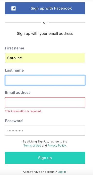
You can stop this issue from losing you submissions by including a link to your privacy policy beneath your form—like this example by ClassPass:
Before someone hits the “Sign up” button, they’ve got the opportunity to view the company’s terms of use and privacy policy.
That’s essential if you’re collecting data on visitors in the E.U., and it will help to avoid a hefty fine under new GDPR laws. Your audience needs to know how their data will be stored before handing it over.
Your privacy policy isn’t the only way to instill this sense of trust. You could add:
- A message on how their data is used—e.g. “We use this data to find the best match.”
- Your commitment to storing data safely—e.g. “We’re committed to keeping your information secure.”
- Exactly what they’ll get in return—e.g. “No upfront cost. Cancel anytime.”
6. Use conditional logic
Terms like “conditional logic” usually conjure thoughts of coding and engineers. But when applied to lead forms, this can be an effective method to increase conversion rates and the quality of leads by asking your leads targeted questions.
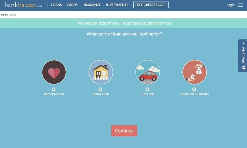
With conditional logic, you can ask questions and yield information based on answers to previous questions. For example, when applying for a loan from BankBazaar, the first thing they ask is what the loan is for:
Because each loan has different needs and terms, it doesn’t make sense to ask the same follow-up questions for each loan type. For example, this is the second step when selecting “Car Loan”:
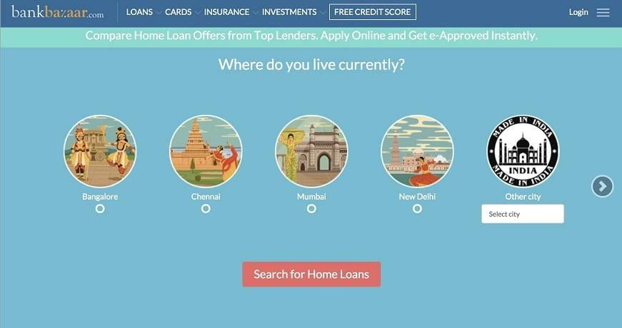
Selecting “Home Loan” will take you somewhere completely different:
You can do this in any industry. For example, B2B brands can ask what role/function the lead works in before asking persona-driven questions. This way, you can nail lead segmentation without the headache—for both sales and marketing.
Final thoughts
As you can see, boosting the number of conversions you’re getting from your forms isn’t an uphill task. A few small tweaks could be the change you need to skyrocket your submission rates. Using a tool like WordStream’s Conversion Toolkit—included for free with every WordStream Advisor subscription—can make testing and optimizing your forms quick and easy.
However, there’s one thing to remember: Always double-check your forms are working before you set them live. You’ll see a big fat zero when viewing your form analytics if you’ve accidentally made a coding mistake throughout this process, so test your forms on various devices before releasing them on your website.
Now, you should be good to go!
About the author
Marcus Taylor is the founder & CEO of Venture Harbour. He was recognized by Forbes as an influential marketer on the 30 Under 30 Europe 2018 list.





0 Comments