You already know that highly optimized landing pages are crucial to the success of any paid search campaign. However, even the best landing pages don’t have conversion rates of 100%. Why? Well, because people are unpredictable, and sometimes, consumer behavior defies all logic – frequently due to cognitive biases.
In today’s post, we’re going to examine what cognitive bias is, look at several examples of these behaviors in action, and outline how you can overcome (or at least account for) them with your landing pages.
What is Cognitive Bias?
Cognitive biases are ways of thinking about and perceiving the world that may not necessarily reflect reality. We may think we experience the world around us with perfect objectivity, but this is rarely (if ever) the case. Each and every one of us sees things differently based on our preconceptions, past experiences, and environmental or social factors, but this doesn’t necessarily mean that the way we think or feel about something is truly representative of reality.
Simply put, cognitive biases are the distortions of reality through which we view the world.
How to Overcome Cognitive Biases with Landing Pages
So, now we know that we’re all completely irrational, let’s look at some of the most common cognitive biases in action and what you can do to mitigate their impact on your paid search campaigns. Before we go any further, it’s worth noting that there is no single definitive “list” of cognitive biases. Since the term was coined by Daniel Kahneman and Amos Tversky in the early 1970s, more than 100 separate cognitive biases have been identified, and psychologists continue to explore new behaviors that could be classified as cognitive biases. For marketers trying to get a grip on consumer behavior, this isn’t great news.
Obviously, covering how to account for all known cognitive biases with landing pages is impractical for the purposes of this post. We will, however, look at a few of the most common and how you can try to account for them with well-crafted landing pages.
1. Confirmation Bias
One of the most common cognitive biases is confirmation bias.
Confirmation bias is when a person looks for and interprets information (be it news stories, statistical data or the opinions of others) that backs up an assumption or theory they already have. For example, if you presented someone with hard evidence that gender bias exists, and they are already convinced that it doesn’t, they’re much more likely to dismiss the evidence rather than reconsider your opinion.
Common characteristics of confirmation bias include:
- An unwillingness to accept the validity of evidence that defies the person’s previously held beliefs
- Placing greater weight or emphasis on “facts” that appeal to the person’s underlying assumptions, to the exclusion of contradictory evidence
- Actively seeking out information that “proves” the person’s point
- Selective (and often incorrect) recollection of events, facts or statistics
Mainstream news outlets are often guilty of manipulating viewers’ confirmation bias (Fox News is an excellent example of this). As a result, people don’t choose one media outlet over another because of its impartiality or journalistic integrity – they watch the same news channels regularly because their programming appeals to the viewer’s preconceived ideas and opinions.
How Can You Overcome Confirmation Bias on Your Landing Page?
If you’re trying to compensate for confirmation bias when selling to customers, you’ll have to make your prospects doubt the strength of their beliefs. One way to accomplish this by including testimonials from formerly skeptical customers.
Reach out to your current clients and ask them if they weren’t entirely sold on your product or service to begin with, then ask them to provide details about how they came around. Include specific details, such as concerns about pricing, tempting offers from your competitors, and anything else that could dissuade biased customers from converting.
Resist the temptation to badmouth your competitors – this is unlikely to have the desired effect. By resorting to the marketing equivalent of a political smear campaign, you’re positioning yourself in a negative way, which could actually reinforce the very bias you’re trying to overcome. Also, be sure to write in the voice of the customer. Use the same language your prospects would to avoid alienating them with terms they may not understand.
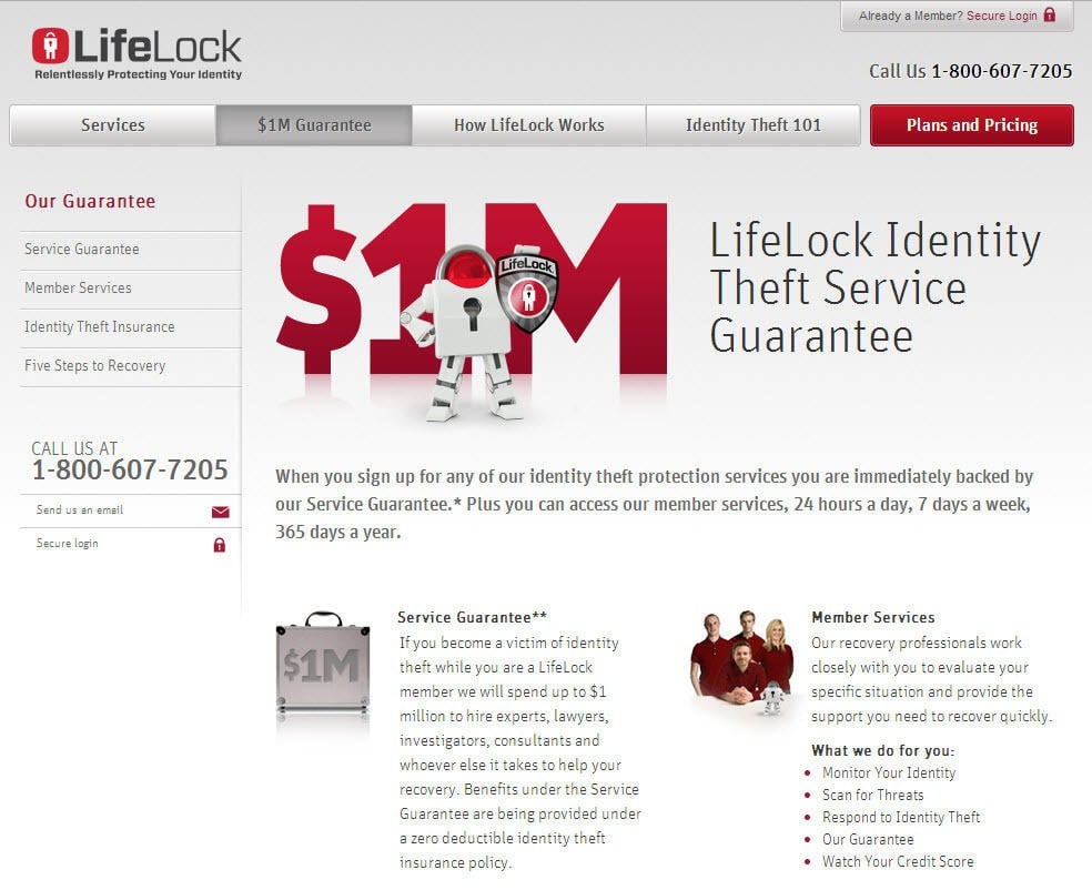
Another tactic you can use to overcome confirmation bias is by offering a zero-hassle, no-strings-attached money-back guarantee. Online identity theft prevention service LifeLock does this incredibly well with its $1 million guarantee.
Realizing that some customers might be negatively biased about the effectiveness of identity theft prevention services, LifeLock goes one step further than the competition by offering up to $1 million in legal assistance, private investigation services and anything else you need in the event your identity is compromised while subscribed to the service. This not only offers customers a considerable financial safety net, it also speaks volumes about LifeLock’s confidence in its services.
2. Anchoring Effect
Sometimes referred to as the “relativity trap” or “focalism,” the anchoring effect is when consumers focus on a single aspect of a product or service to the exclusion of all other considerations. For many consumers, price is the most important part of the decision-making process, often understandably so.
People experiencing the anchoring effect often:
- Ignore the potential benefits of a product or service in favor of focusing solely on price
- Comparison shop more extensively than other consumers
- Actively seek out money-saving deals such as coupons, sales or other incentives
- Respond well to flexible pricing structures
Many businesses actively exploit the psychology behind anchoring, particularly restaurants. By including a wide range of dishes at varying prices (some very expensive, some much more affordable), they manipulate most customers’ tendency to choose the mid-priced option. People do this because they tend to fixate on the relative savings or difference in price between two options, not the actual prices themselves.
Although the anchoring effect can present unique challenges to marketers hoping to overcome cognitive biases with their landing pages, it’s a double-edged sword – since prospects experiencing the anchoring effect are only focused on one thing, it’s easier to address and deal with their primary objection.
How Can You Overcome the Anchoring Effect on Your Landing Page?
Firstly, let’s say that, for the sake of example, that your prospects are indeed solely focused on pricing. Now we’ve established what obstacle you have to overcome with your landing pages, let’s take a look at how you can actually do it.
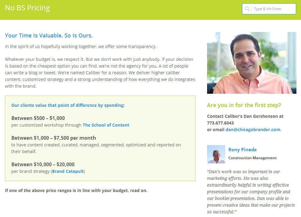
Firstly, be as open and transparent about your pricing as possible. That not only means actually including pricing information on your site, but putting it on your landing pages, too. Don’t make a prospect hunt for pricing details – the longer you make them wait (or work), the less likely they are to trust your business. Be upfront, and put your prices right out in the open.
Also, be completely honest with your pricing – include all surcharges, fees, taxes and anything else that could drive up the price. We’ve all been in situations where we “agree” with ourselves to buy something while under the impression it costs one amount, only to be unpleasantly surprised when the price rises due to hidden costs (major airlines, anyone?).
Chicago-based branding agency Caliber exemplifies these principles very well. Unlike many similar agencies that hide their pricing behind “free consultations” and other smokescreens, Caliber openly displays its rate card on its site – and even admits that it doesn’t work with just anyone. As a one-two punch, Caliber also displays a customer testimonial alongside its pricing information – a shrewd move.
3. Ambiguity Effect
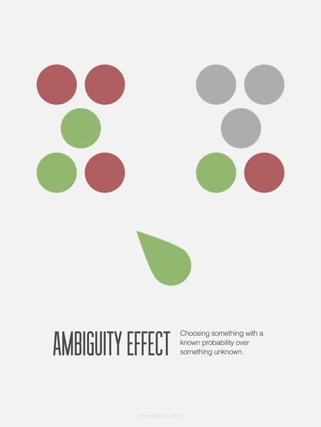
Although they might not realize it, many consumers experience some degree of the ambiguity effect, a cognitive bias first identified by Daniel Ellsberg (one of the key figures in the Pentagon Papers scandal) in the early 1970s.
This cognitive bias can be best summarized as the decision to favor a choice with a known outcome, rather than “take a chance” on a choice with unknown probabilities. From a psychological standpoint, the ambiguity effect is closely related to risk aversion.
Common characteristics of the ambiguity effect include:
- A tendency to favor decisions with familiar outcomes
- Reluctance to try new things
- Limited ability to recognize long-term benefits of “riskier” decisions when weighed against the marginal gains resulting from “safer” choices
For example, many investors choose to put their money in “safer” investments such as government bonds, as the perceived return on investment is relatively certain due to bonds’ strength and safety as an investment vehicle. Stocks and shares, on the other hand, often result in significantly higher ROI, but many investors shy away from these investments due to the unknown (or ambiguous) outcome of this type of investment strategy.
Artwork © Jack Hagley
From a consumer perspective, the ambiguity effect can be a powerful motivator when it comes to customer loyalty. Even if a consumer is dissatisfied with a service provider, the perceived risks of switching to another company are often greater than the potential gains of making the switch.
How Can You Overcome the Ambiguity Effect on Your Landing Pages?
To some extent, all businesses have to overcome the ambiguity effect when attempting to entice certain customers, especially startups and very new businesses that do not have an established reputation.
One way to overcome this cognitive bias is by borrowing techniques from great FAQs and incorporating them into your landing pages. This has to be done carefully, as too much text could harm your conversion rates. However, by including some skilfully worded questions and answers into your landing page copy, you could fill the gaps in your prospects’ knowledge about your product or service and make your offers seem more appealing.
An excellent example of this principle in action is a landing page for Unbounce’s landing page conversion course. It presents a summary of information about the course in a conversational way (“What’s in the course?”), goes into greater depth about each of the course modules, and includes information on the type of people who will benefit from taking it.
The page’s copy makes the time commitment necessary to complete the course abundantly clear, further reducing ambiguity about the amount of effort involved. It also includes a simple form and strong call to action (essential for increasing conversion rates), clear directional cues, and a clean, appealing design.
4. Bandwagon Effect
This cognitive bias is closely related to a psychological phenomenon known as herd mentality. Individuals experiencing the bandwagon effect place much greater value on decisions that are likely to conform to current trends or please individuals within their existing (or desired) peer group. From a consumer perspective, this can be summarized as making purchasing decisions out of a desire to have and be seen with “the next big thing,” or to increase their perceived social status by owning a particular product.
Characteristics of the bandwagon effect (from a consumer perspective) include:
- A tendency to overlook product specifications in favor of design/aesthetics
- A willingness to spend significantly more on branded goods
- A strong desire to “fit in” with demographics seen as stylish/trend-setting
- Often very loyal to a handful of recognizable brands
- Significantly more likely to evangelize about brands/companies through social channels
The bandwagon effect is such a common cognitive bias because of people’s deep-seated need to conform and fit in. Many consumers’ devotion to Apple products is a great example of the bandwagon effect in action. Apple has the kind of following that many businesses are envious of, and through skilful marketing campaigns and very clever branding, Apple manages to manipulate consumer behavior like few other companies – resulting in overwhelming demand for the next iPhone or iPad, and the perception that choosing Apple products is a lifestyle choice, not merely buying a new phone or tablet.
How Can You Overcome the Bandwagon Effect on Your Landing Pages?
If your business operates in a highly competitive or crowded market, the key to overcoming the bandwagon effect is how you frame your product or service. In fact, you may want to view the bandwagon effect as a state of mind you can capitalize on, rather than an obstacle.
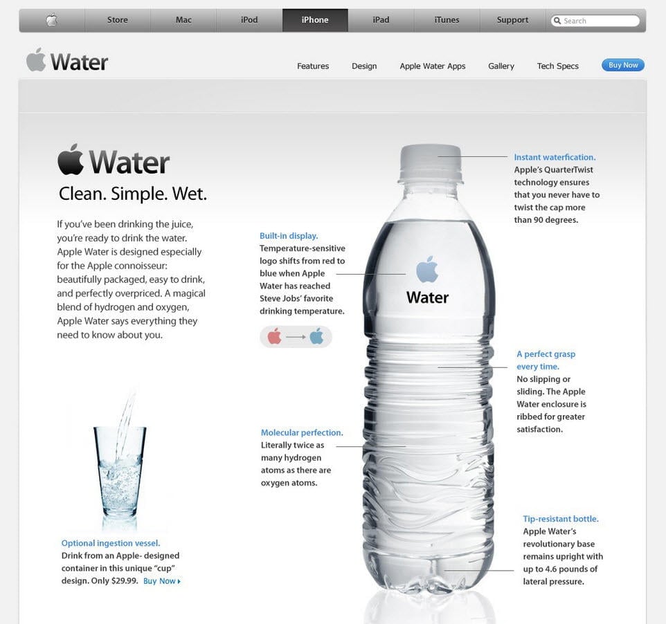
Imagery is incredibly important when it comes to promoting your goods or services. Again, using Apple as an example, the marketing materials for the iPhone don’t just focus on what it does (though features are important) – they promote an ideal; that the iPhone is far more than just a smartphone, it’s an indispensable part of your modern digital life. With this in mind, use stylish imagery to promote your products on your landing pages, and heavily emphasize how your goods will enrich the lives of your customers. For instance, the landing page for the iPhone 5S leads visitors to a page with a video titled “Powerful”:
In the video, young, attractive people use their iPhones to perform a range of tasks that, in all likelihood, most iPhone users would never bother with (such as using an app as an amp controller for an electric guitar and the phone itself as a virtual violin as part of an art installation), but that’s not what makes this marketing so brilliant. The secret to this video’s success is that it sells the lifestyles of the people in the video – it manipulates consumers’ desire to be cool, to be in a band, to embark on an exciting road trip to a far-away place. In short, it sells an idealized life that buying an iPhone can help consumers attain.
Of course, it’s difficult for some businesses to effectively emulate Apple’s marketing efforts. However, the principles can be applied to virtually any company, with a little creativity. Take Boston-based clothing e-commerce site Ministry of Supply, for example:
Ministry of Supply makes and sells high-end dress shirts and other clothing made from “phase change” materials – fabrics that store or release heat depending on the body temperature of the wearer. These fabrics are also used by NASA in its spacesuits for astronauts. This unique selling proposition, combined with the site’s effortlessly stylish imagery, appeals to their ideal customer’s desire for hip clothes that most people haven’t heard about. These concepts are also applied to Ministry of Supply’s social media presence, resulting in strong brand consistency and high community engagement among its customers – just like Apple.
Admittedly, Ministry of Supply is missing some opportunities to increase conversions as their PPC ads lead directly to their homepage instead of a dedicated landing page, but the same principles used by Apple to exploit the bandwagon effect are being used in a highly effective way by this small business.
5. Status Quo Bias
Many psychologists agree that cognitive biases are based on survival instincts. Our fifth and final example, status quo bias, is a prime example of how our need for stability and routine can influence our behavior.
Status quo bias is a preference for things to stay relatively unchanged. Individuals experiencing status quo bias often perceive any deviation from the “usual” as negative or a loss, resulting in a strong aversion to change. For marketers, customers with status quo bias can be a real challenge.
Individuals experiencing status quo bias are often:
- Hesitant to try new products or services out of a fear of loss resulting from change
- More resistant to traditional sales techniques
- Inadvertently loyal, even to brands offering inferior service
One of the biggest hurdles to overcome when selling to a prospect with status quo bias is the “if it ain’t broke, don’t fix it” mentality. People with this cognitive bias may be extraordinarily reluctant to part with their current service provider – even if they’re unhappy as a customer – simply because they don’t want to disrupt the status quo. However, if someone with status quo bias has clicked on one of your ads and ended up on a landing page, you’re already part-way toward overcoming their fears and converting them. All you have to do is present them with at least one compelling reason to leave their comfort zone.
How Can You Overcome Status Quo Bias on Your Landing Pages?
In his best-selling book, “The Ultimate Guide to Google AdWords,” marketing expert Perry Marshall explains that writing ad copy that promotes a feature of your product is a mistake. According to Perry, people don’t care about what your product does – they want to know how it will solve their problems. Highlighting the emotional payoff in your ads can convince even the most hesitant prospect to click, and this principle can also be applied to your landing pages.
If you want to overcome status quo bias with your landing pages, you’ll need to focus heavily on the benefits of your product or service. Remember, if a potential customer has already clicked on your ad, then they do want to explore the possibility of using your product or service, even if they may be hesitant to embrace change. Similarly to the FAQ approach in our ambiguity effect example, use language that can directly answer any questions your prospects might have during their first experience with your company. This spares them the effort of having to seek out additional information once they reach your landing page – a crucial step for people with status quo bias, as any obstacle (no matter how seemingly minor) could be perceived as a loss and dissuade them from converting.
One company that accomplishes this very well is small-business project management software platform Basecamp:
Everything about this page is friendly and accessible, from the layout to the language. As in our anchoring effect example, the pricing information is made clearly available from the outset (including Basecamp’s highest pricing tier) which helps to establish trust through transparency, and there are several frequently asked questions provided to enable prospective customers to learn about Basecamp and take action without leaving the landing page.
Of course, these are just a handful of the various cognitive biases your prospects may experience, and it’s impossible to account for all of them. However, it’s worth bearing consumer psychology in mind when making landing pages, as even subtle changes can have a big impact on your conversion rates. Hopefully this post has given you some food for thought.










0 Comments