Though it is one of the older digital marketing strategies, email marketing is still around because it works. Businesses use this versatile platform to generate and nurture leads, strengthen client relationships, build their audience, and obtain more customers. So how do they get these email addresses in the first place? They ask. Placing call to action phrases and buttons on your website and other forms of content is a great way to collect email addresses to build your email list. Below are 20 real examples of email signup calls to action that help to illustrate call to action best practices.
Call to action examples for email signups
With first-party data becoming more important than ever, getting email signups is crucial. Let’s take a look at some real subscribe CTAs, to help you build your list.
1. Nuzzle
With the adorable little fella in this call to action, how could we not include this example? All cute pups aside, we also like the simplicity of the design and the attractive colors. NOTE: This does not mean you should use your pooch to get email signups. Nuzzle is a dog collar company, so this image is relevant to their business.
2. Business Development Bank of Canada
We like a few things about this email signup call to action. The “FREE”, in red and all caps, informs the user of important information right off the bat. The description below is short yet it lets you know exactly what you’re getting, and how. By reassuring that you can unsubscribe at any time, and including a visual example on the left, BDC reduces the risk and uncertainty of signing up.
3. Cabot
While the previous call to action uses detail and design, this one uses more simplicity and exclusivity. “Become a Cabot Insider” appeals to the human desire to be a part of something special. The short description lets users know exactly what to expect, and the green color of the subscribe button creates a welcoming and safe feel.
4. Digital Trends
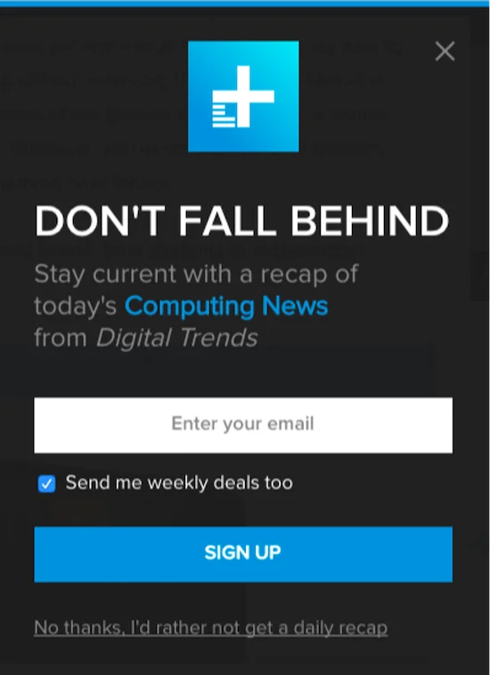
Digital Trends does not go into extreme detail about what you will get for signing up for their email newsletter. They assume that you are on their site to get their Computing News and thus will have an idea of what a recap will look like. Instead of detail, they focus more on urgency with their “Don’t Fall Behind” headline, as well as on asking for permission to send additional emails. Another unique aspect of this call to action example is that the “no” option is not an X, but a longer, more human-sounding statement.
5. The Country Cook
What we like about Country Cook’s email signup call to action is its personalized language and attractive design. Words like “pop” and “gimme” add some fun and excitement. The message below the actual button addresses some of the hesitations a user might have and adds a human element to this digital box. There are quite a few exclamation points in here, which has its pros and its cons. In addition, the black color of the field text draws attention away from the rest of the elements in the call to action, which may or may not be intended.
6. DIY Site
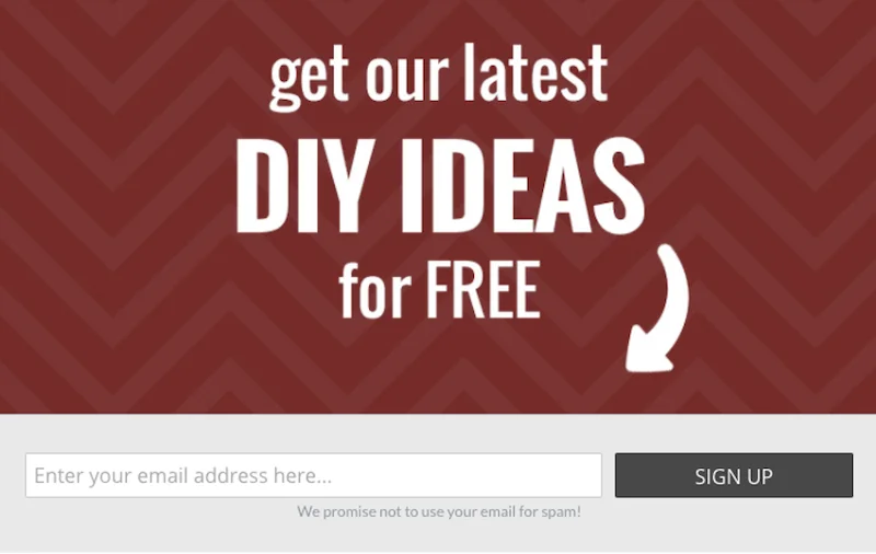
This DIY site uses the same approach as Country Cook, creating the feel that a human is calling you to this action. In addition, the simplicity of the message, the use of bold font and contrasting colors, and the big white arrow makes this an eye-catching graphic.
7. SMS Global
This email signup call to action takes an effective approach of highlighting first the benefit to the reader (“Grow Your Knowledge”). The use of “Don’t Fall Behind” in example #4 has a similar effect but more of a negative connotation. This call to action also appeals to the human desires of belonging (“Join thousands”) and exclusivity (Don’t miss out!). Finally, the use of “now” in the subscribe button creates urgency.
8. Investopedia
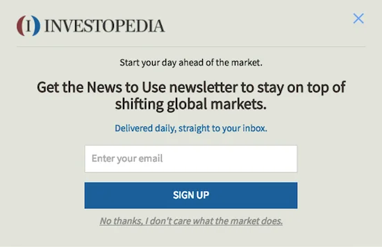
Like Example #7, Investopedia encourages the reader to sign up by highlighting the benefit it will bring to them. They also clarify the frequency of the emails, reducing uncertainty. Like Digital Trends, this call to action uses a more human-sounding phrase for the “no” option. Unlike Digital Trends, this phrase is a bit more witty. This type of approach has its pros and cons as well, with regard to brand voice and user experience.
9. Printsome
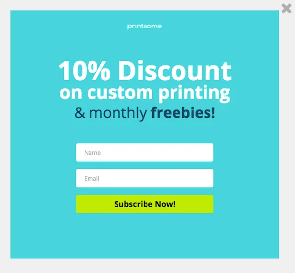
This call to action by Printsome is different from the ones before it as it asks for the user’s name as well. In addition, it creates an incentive for signing up, with both an immediate and long-term offer. The subscribe button is bright and eye-catching, and uses urgency and excitement.
10. Remote.co
This call to action example is worth noting because it uses a large, attractive image and immediately conveys the purpose of signing up. In addition, the text below the headline attracts attention with the use of a question, and clarifies the email frequency for the subscriber.
11. Teddy Bear Club
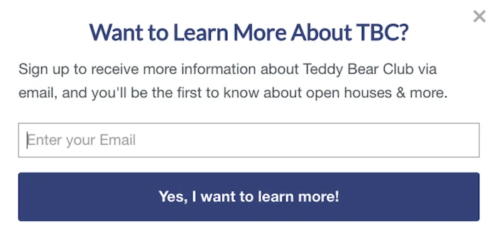
What makes this email signup call to action unique from the rest is that it starts with a question. Questions can be a good way to catch the reader’s attention. The description doesn’t provide explicit details into what kind of information the subscriber will get, aside from “open houses and more”, but it does provide the benefit to the reader: being the first to know. The actual button, however, is a bit confusing. “Learn more” makes it uncertain as to whether clicking the button is the last step for signing up or will bring the user to another information page.
12. Crush Boutique
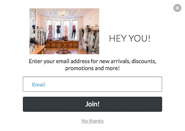
We like Crush Boutique’s email signup call to action because even though “you” isn’t as effective as seeing your actual name, the phrase “hey you” certainly grabs your attention in a friendly way. We also like its simple and attractive design. The word “Join” reassures the user that clicking that button will complete the action of being added to the list. There is also more than one option to exit, which can help the user to feel less confined and more in control of their experience.
13. Popsugar
PopSugar’s email signup call to action contains a few elements that we haven’t seen yet in the above examples. The “Signup with Facebook” option may be preferred by regular Facebook users, and is sometimes quicker and requires fewer steps. The call to action phrase at the bottom creates transparency for Popsugar and confirms for the user the action they are taking—giving Popsugar permission to email them. However, including “agree to the Terms” may cause the user to feel like they are committing to something bigger than they thought, and to feel hesitation. If this is, in fact, a legal requirement, including it at the bottom and in small font is the best solution.
14. Living Social
Like Popsugar, Living Social also includes a consent statement, at the bottom and in a small font. But what we really want to point out here is the simple and attractive design, the gift icon to convey that the reader will get something out of this, and the use of an offer to encourage signups. However, it is unclear as to whether this 80% refers to a single coupon or the average discount for items on their site.
15. Nav
Nav’s call to action for their email newsletter is a great example of concise copywriting. It tells the user the ultimate value of the newsletter and then clarifies how often the email will be sent. The example email, with it’s clean and branded design, to the right, is an added element of appeal.
16. Unreadit
Unreadit’s approach is unique in that it doesn’t just tell you what the newsletter provides, but why. Because “You shouldn’t start the week with just work emails.” It then provides the details that potential readers want to know, but in bullet form, including past issues, day and time of email send, and how many subscribers.
17. Later
Later newsletter uses that common approach of inviting the visitor to join an existing community, as well as that of giving the opportunity of being the first to know and detailing exactly how frequently the newsletter arrives. Even better, on the right you see samples of emails that you would receive, which allows people to get a taste and intrigue their curiosity.
18. Austin Kleon
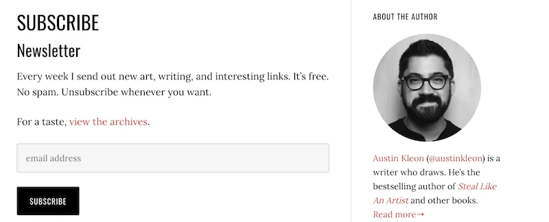
Austin’s copywriting style is in line with his simple three-color branding. In 19 words, he tells you exactly what you need to know and then gives you the opportunity to view the archives for added reassurance. His author bio on the right is also a helpful way to add personalization and build familiarity.
19. Data Viz
Data Viz takes a bold move here by simply including their newsletter CTA at the end of their website. This format expresses confidence that their website encompasses it all, and that their newsletter is just an extension of what the visitor has already seen. Plus, the “We never share your data” is clear and concise.
20. Mel’s Sandbox
Started with a dog, gotta end with a dog. The Mel’s Sandbox email newsletter CTA is short and simple, even including the average word count for each email, which can get more of the fast-paced skimmers to sign up.
Get more email subscribers with better calls to action
You may have noticed some common themes and best practices in the call to action examples above, such as:
- Reduce uncertainty for potential subscribers by giving them an idea of what to expect.
- Try out different approaches: authoritative, short and sweet (slightly bold), reassuring, casual.
- Incorporate elements of urgency and excitement.
- Be human with your copywriting; people like people.
One final tip: As you build your email list, you should also clean it out regularly to keep your ROI strong.
Hopefully these examples have given you some inspiration and tips to brush up your email signup copy on your website, whether on your homepage, your blog, or wherever else you encourage interested readers to join your community. And if you’re looking for email examples and inspiration, download our 30 Free Small Business Email Examples & Templates!









0 Comments