Accepting that your site has a high bounce rate is a little like accepting that maybe, just maybe, your child isn’t the best-looking kid in the schoolyard. Sure, you think your precious little angel is just adorable (and just so we’re clear, we’re talking about your website now), yet when you head into Google Analytics to check the numbers, your bounce rate tells a different story.
It’s hard to come to terms with. After all, you love your website, so why doesn’t everybody else?
What Is a Good Bounce Rate?
Of course, just as beauty is in the eye of the beholder, so too is what constitutes a “good” bounce rate. Some sites might view a bounce rate of 80% as awesome, whereas other sites might see this as nothing short of catastrophic. It really depends on your site and business goals.
Regardless, many site managers and webmasters pay close attention to bounce rate as an overall indication of a site’s “stickiness” or appeal, and would like to reduce this troublesome number as much as they can. Some people even think that bounce rate can influence your search rankings, via Google’s new machine-learning algorithm RankBrain. So it’s obviously in your interest to optimize this SEO metric.
In today’s post, we’ll look at 11 ways you can do just that.
However, before we dive in, we need to talk about the flaws inherent in bounce rate as a performance metric and what this means for you as a marketer.
A Brief Note About the Problems with Bounce Rate
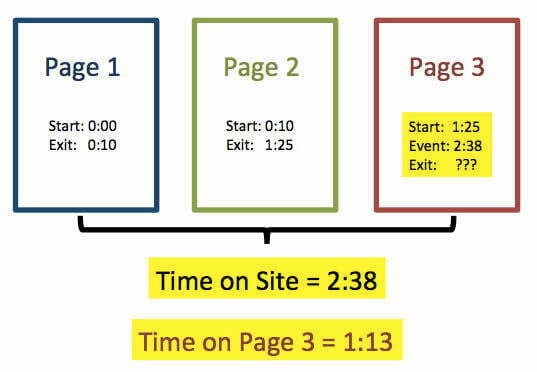
Alongside Bounce Rate, you’ve probably noticed the Time on Page metric in Google Analytics. This, as its name implies, is an estimate of how long on average users spend on a given page. The reason Time on Page is an approximated metric, rather than a clearly defined measurement, is because Google Analytics (and other analytics platforms) requires two clicks to accurately calculate Time on Page; an “entrance” click – typically the link click that brings a user to a page in the first place – and an “exit” click, usually a click on a navigational element that takes them away from a page.
Unfortunately, this crucial exit click is often missing from the equation. Ever spent a few minutes reading a page before closing the tab (or the browser)? If so, Google Analytics couldn’t accurately measure the Time on Page because it missed that vital exit click during that particular session. In this example, it doesn’t matter if a user clicked onto a page, read every single last word of an 8,000-word blog post, and left entirely satisfied – if they closed the tab without exit clicking, that session is logged as a bounce. The same goes for sessions in which a user opens a link in another tab and leaves the original tab open before eventually closing their browser.
This is why bounce rate, as a metric, kind of sucks.
Rigby knows how much bounce rate sucks.
As a result of this inherent flaw, many marketers are moving away from their reliance on bounce rate as a metric and are instead focusing on so-called “attention metrics” such as dwell time and scroll depth. It’s simply too difficult to accurately measure bounce rate (and Time on Page), but it’s still worth trying to keep your bounce rates low.
Still, if your bounce rate is insanely high, or suddenly spikes due to changes you’ve made on your site, you’ve got a major problem to deal with.
With that caveat out of the way, let’s look at how you can make your pages stickier and reduce that pesky bounce rate.
1. Optimize Page Load Time
Many marketers assume that if their bounce rate is high, the issue must lie with a page’s content – when, in fact, serious problems can arise before a user even has the chance to read a page at all.
Of all the problems a web page can have, taking forever to load is arguably the worst. After all, it doesn’t matter how good or bad a page’s content is if a user can’t read it (or even see it), and 47% of users expect a web page to load in two seconds or less, making on-page optimization crucial to reducing your bounce rate.
This is especially true for mobile sites. According to data from Radware, a connection speed delay of just 500 milliseconds can result in an increase in “peak frustration” of more than 26%, and a decrease in engagement of 8%.
Further, slow-loading pages are among the leading causes of shopping cart abandonment for ecommerce retailers. Amazingly, only 2% of the world’s leading 100 ecommerce websites have mobile sites that load fully in less than five seconds on mobile devices – and one-fifth take almost eight seconds to load completely, an almost criminally long time for sites that live and die by conversion rate optimization.
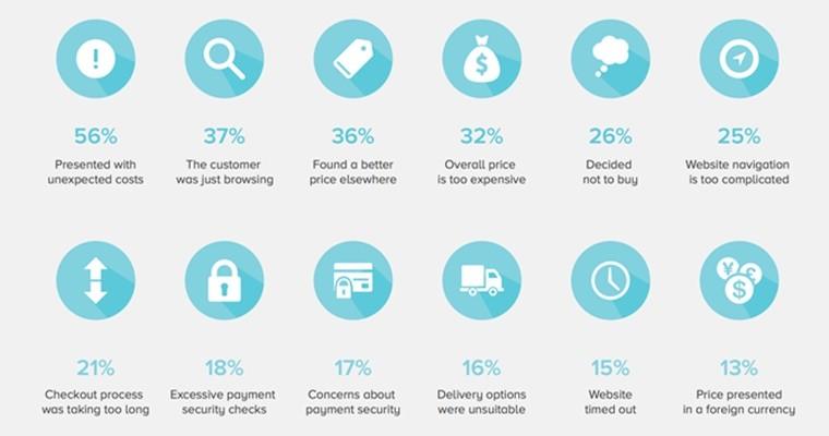
Shopping cart abandonment percentages (Image via Search Engine Journal)
Before you even think of looking at the content of your pages, make sure your visitors can actually view them in a reasonable amount of time.
2. Make Your Content More Accessible with Smart Formatting
Ever clicked through to a blog post or web page, only to discover an immense, intimidating wall of text? If so, you already know how discouraging this can be to readers. Even if your content is incredibly valuable and completely unique, it won’t matter if your readers are scared off by the prospect of wading into a blog post of equal density as War and Peace or Les Misérables.
Some blog posts read a bit too much like this; and as such, are formidable
Formatting your pages to be as welcoming and accessible as possible is one of the best ways to reduce your bounce rate. The less “work” a visitor has to do to get what they want, the more likely they are to stick around. Don’t overwhelm your visitors with weighty paragraphs that span entire pages, and make use of white space to make your content more approachable.
Here are some ways to make content less visually intimidating:
- Appropriate use of headers
- Frequent subheadings
- Suitable images
- Bulleted lists (see what I did there?)
Use of these formatting options makes your content more accessible and allows the reader to scan or skim your content quickly to identify points that are most relevant to their needs.
That said, don’t insult your readers’ intelligence, either. Trust your audience to know what they need, then give it to them. I’ve seen blogs that, while offering useful information, insist on using a line break or including an image between every single sentence, which can be just as annoying as huge walls of text.
3. Use Sidebar Widgets and Promotions Sparingly
Some web pages are an ideal vehicle for offering relevant content, offers, and other material to your audience. Blog pages are a prime example, and you’d probably struggle to find a decent blog without something in the sidebar. However, cramming the digital margins of your content with ads, offers, award emblems, and other crap is a surefire way to overwhelm your visitor and tempt them to bounce.
Sidebars widgets and promotions can be overwhelming
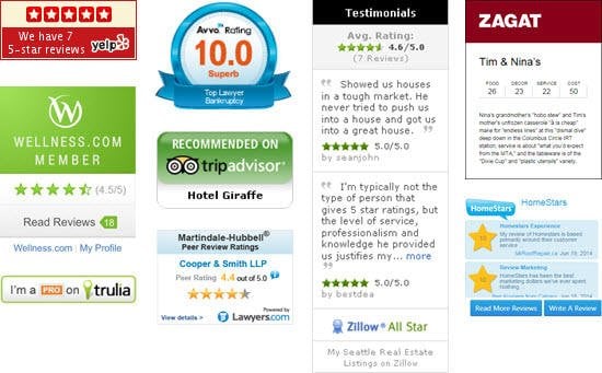
If you want to highlight relevant content from your sidebar, do so in a way that offers the reader additional value. For example, related article recommendations that expand upon the topic covered in a blog post is a great way to make your site “stickier” as well as provide genuinely valuable and useful content to your readers. Similarly, if you choose to include awards and trust signals in your sidebar, make sure they’re from only the most reputable and renowned sources so that they serve an actual purpose.
Also, be wary of the type of pop-ups offered by services such as Bounce Exchange. These promotions can be highly effective, but they can also be terribly distracting, especially if you set them to appear the moment a user visits a page. Give your visitors enough time to immerse themselves in your content before pouncing on them with newsletter sign-up offers or other promotions. Don’t push too hard, too fast.
4. Cross-Reference Bounce Rate with Time on Site
As the old saying goes, “No metric is an island” (or something), and taking bounce rate data out of context can be as dangerous as relying on it exclusively as an indicator of your site’s performance.
It’s important to look at your bounce rate within the wider context of your site in general. Doing so allows you to ascertain more accurately whether the problem is with a specific page, a type of page (such as your site’s blog or product pages), or your site as a whole. If your Time on Site metrics are decent, but your blog pages have a high bounce rate, the problem may be with your content. On the other hand, if your bounce rate is high and Time on Site is low, you may not be giving visitors what they want in a more general sense.
Read more on Analytics’ Time on Site metric in this excellent
post by Google’s Justin Cutroni
As with any metric, be sure to investigate usage trends with wider site data to make sure you’re not dealing with an anomalous outlier of a page when making decisions that will affect your whole site, or that you’re not missing a larger problem by focusing too narrowly on the details.
5. Ruthlessly Optimize for Relevance
Aside from technical considerations like page load times or failing to adhere to formatting best practices, one of the biggest contributing factors to high bounce rates is relevance – or irrelevance.
Some sites target certain keywords very effectively, only to serve content that is tangentially relevant to that query at best, or downright irrelevant to it at worst. If the page you’re serving isn’t directly relevant to a user’s query, you can almost guarantee that they’re going to bounce. For this reason, it’s vital that you optimize for relevance above all other considerations.
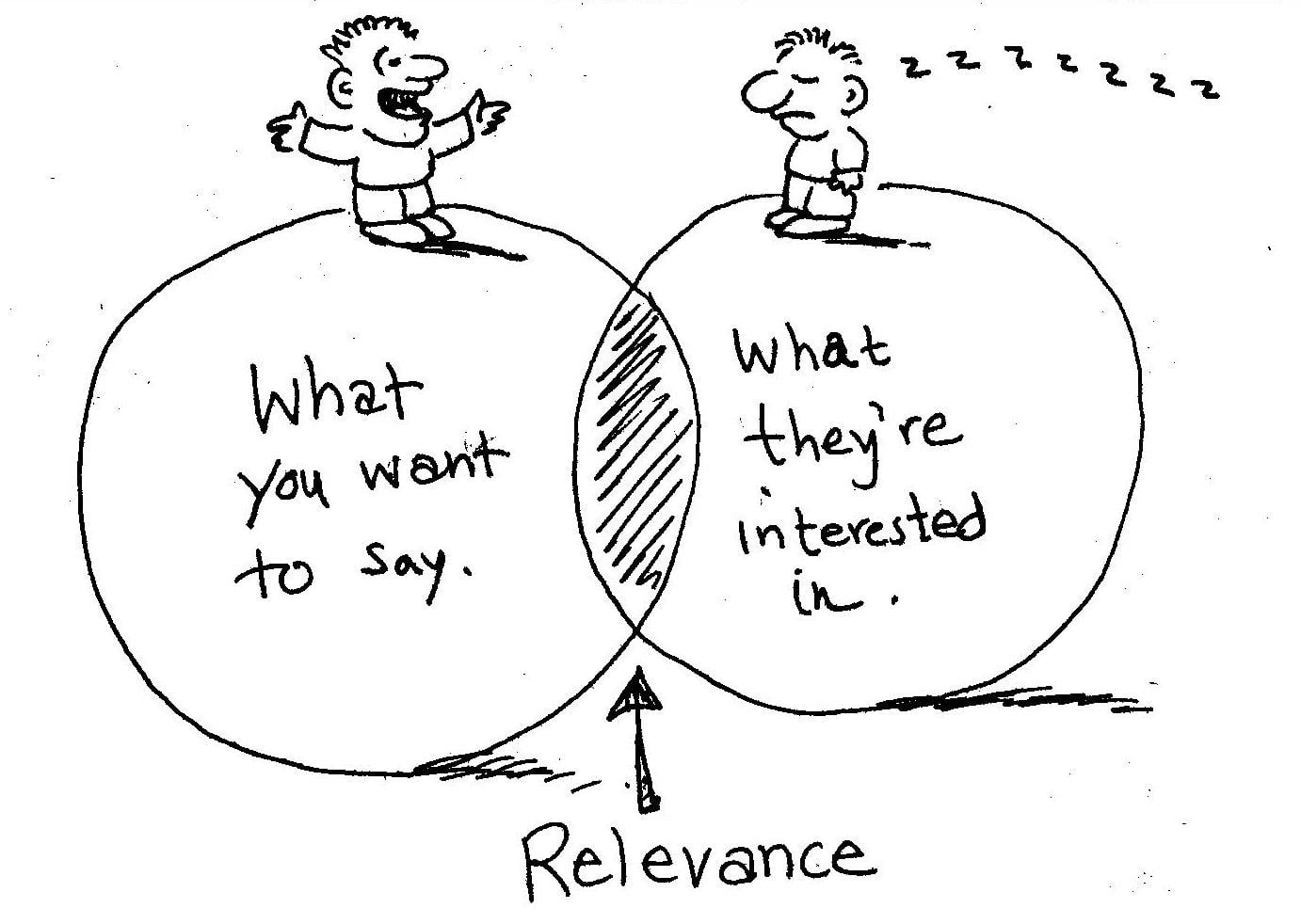
Relevance is the name of the game in Conversion Rate Optimization
If you decide to go after a keyword, and end up ranking for it, make sure the content of the page you serve is highly relevant to that query. Consider user intent when targeting keywords. Is the prospect looking to learn something, or buy something? What stage of the funnel are they in? What problem are they trying to solve? These are all questions that can help you provide the most useful, relevant content to your audience, and the more relevant your content is to users’ queries, the more likely they are to stick around once they’ve arrived on your site.
6. Include a Single, Clear Call to Action
Just as you should consider what the user wants when serving content (as you should be when optimizing for relevance in tip #5), you should also think about what specific action you want users to take when they’ve consumed whatever content you’re offering. Once you know what you want them to do, you can prompt your visitors to take action by including ONE crystal-clear call to action.
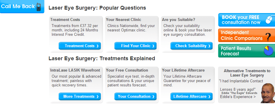
Call-to-actions like this one leave a lot to be desired
The more CTAs you include on a single page, the more likely you are to confuse and overwhelm your visitors. Sure, it’d be great if we could include several CTAs on a single page and trust visitors to diligently investigate and evaluate each before taking an action, but let’s face it – this doesn’t happen very often. Your site should make it effortless for visitors to find – and do – what they want to, quickly and easily.
Don’t overwhelm your visitors with dozens of CTAs. Think about user intent and how your pages can help visitors accomplish their goal, then include a clear, relevant call to action that helps them get the job done.
7. Use a Logical – and USEFUL – Internal Linking Structure
Many people advocate for including dozens of internal links in your content as a way to reduce your bounce rate. Although this strategy can work well, as it provides Analytics with that essential second click to accurately measure Time on Page, it can also backfire by making your content seem, well, a little sleazy or cheap. We’ve all seen sites that link internally in every other sentence, and not only does this look awful, it doesn’t do much to enrich the user experience or offer audiences something of genuine value.
A cramped internal linking structure causes all kinds of readability issues
This principle comes back to relevance. If you have a useful, highly actionable blog post that outlines a specific topic in great depth and would be of interest (and value) to your audience, by all means link to it from other pages. However, don’t go overboard with the internal links. This can confuse and overwhelm your visitors (see above), and can also dissuade visitors from clicking any of the internal links in the first place.
When choosing internal links and anchor text, focus on relevance and a logical linking strategy. If you take a look at our guides on Quality Score, for example, you’ll see that we link to other pages focusing on topics such as bidding in AdWords and click-through rate, because these topics are highly relevant to the topic of Quality Score. It would make much less sense for us to link to articles focused on, say, clickbait or SEO simply because they aren’t relevant to Quality Score.
Resist the temptation to internally link to every article in your archive, and focus on linking to useful articles or pages that are highly relevant and potentially useful to your visitors.
8. Rework Your Product Pages
Getting product pages can be tricky. Offer too much information and you risk overwhelming your visitors. Offer too little and your prospects may not feel as though they have enough information to make an informed decision. However, if you spend even a little time looking at product pages, you’ll probably notice several opportunities for optimization that could not only decrease bounce rates, but improve conversion rates.
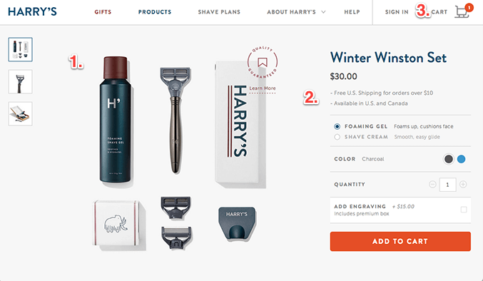
How might we rework this page to optimize for conversions?
One of the major reasons people fail to convert from product pages is because they aren’t ready to complete a purchase or transaction. Sometimes this is as simple as buyer hesitation or an aversion to price, but sometimes, it’s because the information they want about a product isn’t provided. This could include details on where something was manufactured, the specifics of your return policy, or user reviews.
It’s worth remembering that bounce rates from product pages can be a little higher than some other types of page, and that this can vary further depending on the nature of the product or service in question. However, if you’re noticing unusually high bounce rates on your product pages, consider testing whether adding more information helps. Is your return policy clearly stated on your product pages to offset prospects’ risk aversion? Is it clear how and where the product was made? What do your satisfied customers think of your products, and are these rave reviews featured prominently? As always, be sure to A/B test these variables before committing to any firm decisions.
9. Make Your Site Easy to Search
Even in 2016, site search functionality is one aspect of the Web that seems to have remained largely unchanged since the migraine-inducing days of Geocities sites. For whatever reason, site search is considered an afterthought by many websites, representing a huge missed opportunity to provide your visitors with the tools they need to find what they want and reduce your bounce rates.
Non-navigable means high bounce rate
Even the most accurate, relevant content recommendations still put the ball firmly in your court in terms of control. Site search, on the other hand, allows visitors to find what they want, not what you think they want. If you’ve ever tried to search a site only to be presented with a “Page Not Found” or “No Results” page for a search query that should have offered dozens of results, you know how needlessly frustrating this can be.
Sure, your site’s search functionality will probably never be as good as Google, but that doesn’t mean you should overlook or ignore it, either. The more easily users can search for and find what they’re looking for, the more likely they are to stick around.
10. Optimize for Mobile
It’s a little sad that we have to reiterate how important this is, but the number of websites that still aren’t optimized for mobile is breathtaking. With the number of users accessing the Web primarily from mobile devices increasing every year, failing to optimize your site for mobile is practically begging for users to bounce and take their business elsewhere.
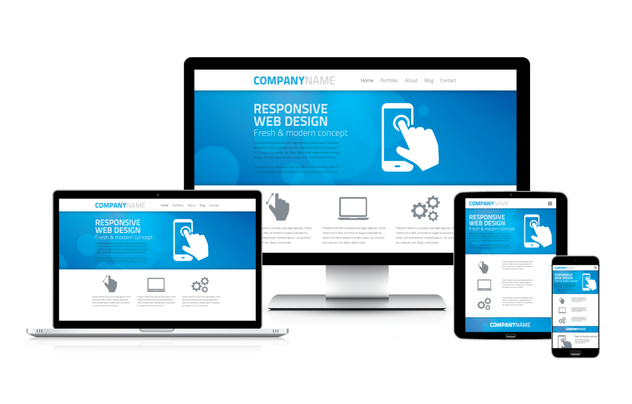
The world is going mobile. Don’t just optimize for it. Make it a priority.
Unfortunately, launching a mobile-friendly site is a huge pain in the ass, especially for larger websites. It’s just that simple. It can be a painstaking process, and may be beyond your own technical capabilities, which means it can also be another (considerable) expense for your site or business. However, it’s hard to understate just how crucial mobile optimization is for every type of site, and you should strongly consider making your site mobile friendly, regardless of the time, effort, and expense involved, or the ulcers or sleepless nights you incur in the process.
It’s also vitally important to remember tip #1 when optimizing your site for mobile. It doesn’t matter how pretty your site looks on an iPhone if it takes more than a minute to load.
11. Make Your Site’s Navigation Effortless
In the simplest (though perhaps harshest) terms, you can think of your site visitors as lazy, entitled, spoiled little snowflakes that want everything spoon-fed to them with minimal effort. This might not be the most pleasant way to imagine your audience, but let’s be honest – if you force your users to do even the slightest bit of work to get what they want, they’ll simply go to another site. For this reason, it’s crucial that your site navigation be as effortless as it possibly can be.
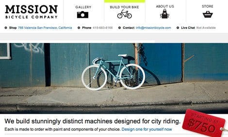
Effortless, clean site navigation
Picture a typical browsing session on your site from the perspective of a user. They arrive at your site, and after evaluating your content for a second or two – and oftentimes that’s literally all the time you have – they decide that although this page isn’t precisely what they’re looking for, your site could potentially give them what they want. They then attempt to locate the page they are looking for, only to find that your navigation is hidden behind illogical animated drop-down menus, or image links that don’t look like image links, or some similarly atrocious navigational horrors.
What do you think they’ll do next? That’s right – they’ll bounce faster than one of those neon-pink rubber powerballs you used to get out of gumball machines.
Your site navigation should be clear, immediately understood, and offer the user a seamless experience in getting from one part of your site to another. Visitors shouldn’t have to guess where they are in your site to know how to get around, and they shouldn’t be forced into artificial pathways that you’ve put in place to shepherd them through your sales funnel. Remember – they’re in control, not you.
Examine your current site navigation and identify opportunities to simplify it. Then simplify it some more. In fact, I challenge you to simplify your site navigation to the point at which it seems almost counterintuitive, because that’s what your visitors want. They don’t care about you, they don’t care about your company – they only care about themselves and what they want, like the lazy, entitled little snowflakes they are.







0 Comments