There is no shortage of articles on the internet that will tell you how to drive traffic to your website. You can invest in online advertising, search engine optimization, influencer marketing, brand building, or one of the other hundreds of traffic generation strategies out there.
Getting traffic isn’t the end-all to digital marketing, though. You still need to serve content that will get those visitors to engage and convert. For anyone who has a business online, the most critical metric is sales conversions.
Let’s look at how you can improve the bottom line.
Why isn’t my site converting?
There are many reasons a website doesn’t convert. Take a look at these top 10 reasons your website is preventing conversions, then start making improvements today.
1. You’re focused on design, not goals
A pretty site with the latest features can be good for appearances, but if it doesn’t help your visitors research or purchase, then it’s serving your company and not your customer. Websites have been the domain of designers and other creatives for a long time. But that’s not enough.
To compete today, you need to be laser-focused on discovering and aligning your website to the goals of your consumers. If you don’t they’ll find someone else who will. Following the latest design trends won’t get you very far. Following your customers’ goals will.
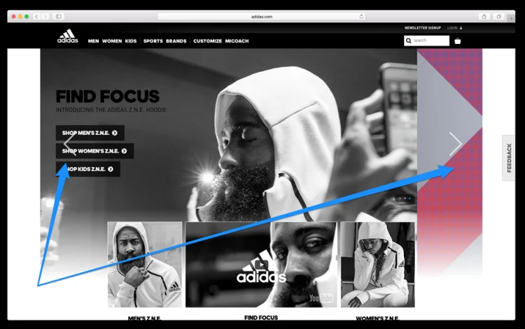
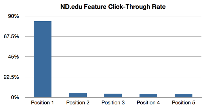
The website carousel is a great example of a popular feature which, unfortunately, the data shows to be ineffective. Popular with web designers – not popular with users:
2. You’re not clear about your value
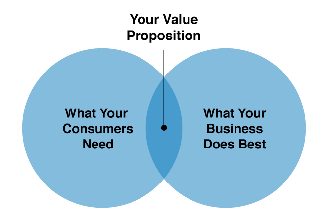
What value can you promise to deliver to your visitor? Is that clearly stated on your website? Too many websites deliver muddled, unclear value propositions or don’t include one at all.
What are the biggest pains your target visitors are experiencing, and how does your solution help them? If you’re not crystal clear on this, you’re missing an opportunity to gain a new customer. Learn more about crafting a great unique selling proposition here.
3. You’re guessing, not measuring
You can’t manage what you don’t measure. The two most frequent problems in that regard are that you either aren’t tracking your website activity at all or you’re simply not reviewing your results.
Many folks know they should be measuring, but have no idea what to look for or what to take away from the data. Start with your goals. What is your objective as a business and what counts as a win? Now work backwards and identify other key metrics and tactics that will help you reach that objective.
From there, you can work on improving those numbers, regularly checking the data to see what’s working and what isn’t, so you can adjust and fine-tune your efforts. (Try the Ladder of Improvement method.)
4. You’re talking and not listening
Too many businesses build their websites using an old marketing mindset. They treat their website more like a one-way billboard communication, rather than a two-way retail store type communication. But things have changed.
Today, power is in the hands of customers. If you don’t help them in their first moments on your site, they’ll go elsewhere. When customers are frustrated with your site, their only options are to abandon the site or call customer service. As a result, your customer service team can be a wealth of feedback.
Do you utilize customer service feedback on your website? Start with this list of 9 simple questions to ask your customer support team at regular intervals. Customer service is the listening post of your operation. Get them started talking, and get ready to take notes.
5. You’re overloading pages with too many options
Analysis paralysis doesn’t only happen when trying to decide what to order for lunch from a jam-packed menu. It happens on your website too. Every page on your website should have a single clear goal.
If you have more than one main clear call-to-action on each page, you’re trying to do too much. Break complex pages into multiple pages that are simpler and easier to navigate.
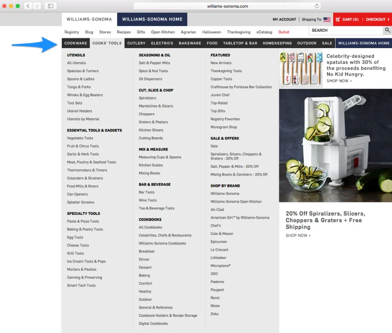
Here’s a good example of giving your visitors far too many choices. What is the goal of this page?
What’s worse is that once you hover over one of these menus, the overload gets even more out of control.
6. You’re sending customers off track – or making them mad
If your navigation or pathways are unclear or confusing, your visitors will abandon your site. Easy to grasp website architecture, effective site search, and clear copy will make a big difference to your visitors.
One particularly common example of this are homepage pop-ups. Marketers love them, yet research continues to show that visitors hate them. Why make your guests’ first impression an annoying one? Even worse, why would you confirm shame a potential customer?
7. You’re not testing
Every business is a little different, and their customers are a little different. Best practices are a good place to start, but you can’t stop there.
A robust testing process is key to taking your website from just ok to a well-oiled machine. Today, there are a variety of tools to help you test the different dimensions of your website. We’re big fans of Hotjar, VWO, Optimizely, Google Analytics, and UserTesting.
8. You’re using too much branding and jargon
You’re not Nike. Your website visitors typically have two goals in mind when they land on your site: to research something or purchase something. If your branding or unclear jargon gets in the way of them getting what they want, they’ll go elsewhere. (If you are leveraging solutions for scalable outside the box synergies, you may want to rethink your copy.)
Branded experience
Helpful experience
Your website should be more like a remarkable in-store experience. Easy-to-find products, helpful customer service, and an overall positive customer experience. Like Dollar Shave Club’s home page, above – a great explainer video and a clear value prop.
9. You’re not answering objections
What are the common hesitations your visitors have when engaging with you?
- Do they not understand your product or service?
- Do they want to see details?
- Do they want to know about pricing?
- Do they want to see how your offers compare to competitors?
Make sure you address the primary concerns clearly and directly. You can get a sense of these concerns a number of ways including:
Answer their questions in your copy, your descriptions, your FAQs, and throughout your site.
10. You’re not proving that you’re trustworthy
If your visitors doesn’t know you from Adam, how are you going to earn their trust? You can use a variety of tactics to increase trust, things like including reviews, testimonials, case studies, relevant PR mentions, and more.
Most of all, if you’re selling something online, it’s especially important to make sure you can demonstrate the security and trustworthiness of your website with trust icons.
Keep Going
These 10 reasons aren’t exhaustive. They’re really just a starting point to help grow your site conversions. But many small changes like this can make a big difference. If you take the time to improve in each of these key areas, you’ll be well on your way to getting more conversions and growing your business.
About the author
David Hoos is a Marketing Strategist at The Good, conversion rate experts who deliver more revenues, customers, and leads. David and the team at The Good have made a practice of advising brands on how to see online revenue double through their conversion rate optimization services.








0 Comments